Eaton · RapidLinkX · UX Design Intern · June – August 2022
A configuration tool for the drives that run an airport's conveyors.
The faster of the two editors we tested, 35% quicker, made 15% more errors, so the slower one shipped.
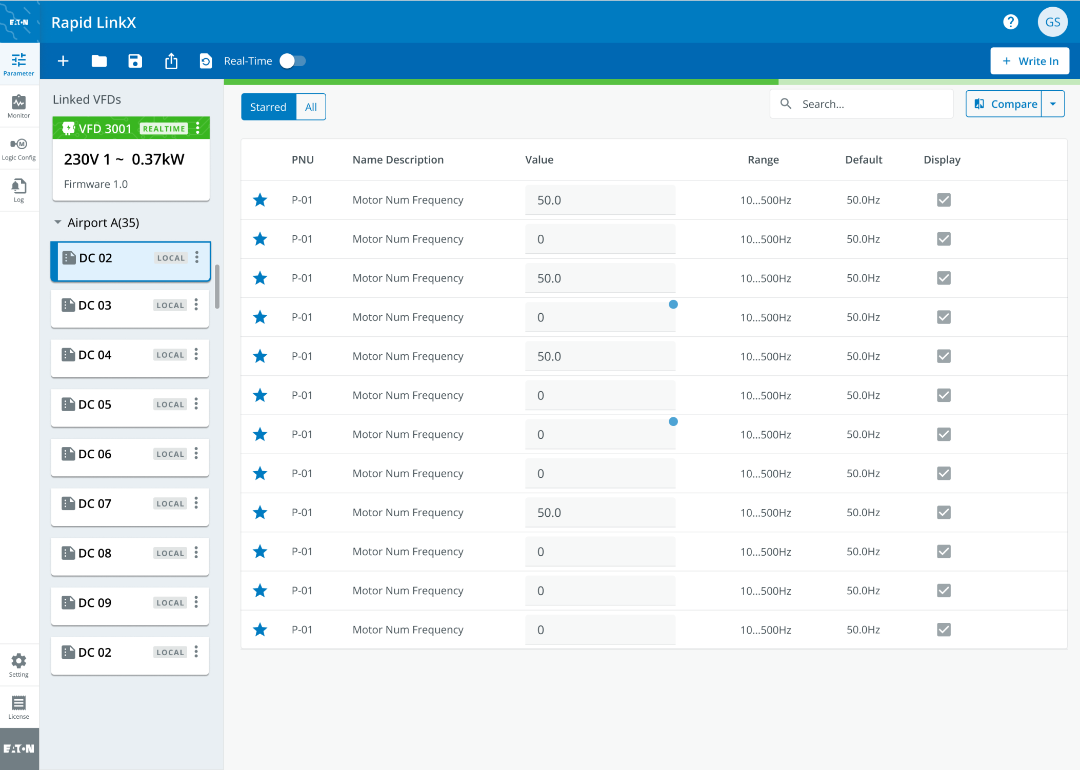
- RapidLinkX, an IoT configuration tool for the drives in airport conveyor systems, used by airport engineers: a parameter editor and a fault monitor, over USB. The drives at Eaton ↗
- Primary designer on the day-to-day product design; my mentor on planning and cross-team communication.
- Stakeholder workshops, secondary research and personas; more than 60 hi-fi pages over 10 workflows, in parallel with the hardware; a comparative usability test; six weeks of hand-off.
- Both shipped, with 14 component variants added to Eaton's Brightlayer design system. In usability testing of the shipped tool, operational efficiency was up 49.7% and error rates down 36.8%.
1The slower editor
A wrong value on a baggage line stops the line. The comparative usability test split its participants between a drag-and-drop canvas and this form: the canvas was quicker, and it made more errors, so it lost (it's under NDA, so it isn't shown).
Two things gave the form part of its speed back. Starred, the toggle above the table, keeps a check to the parameters that matter on a round. Compare puts the live value in one column and a saved configuration or the defaults in the next, so checking a drive is a read across each row.
Both sit among the workflows we refined to shorten the path through a parameter setting and take steps out of it:
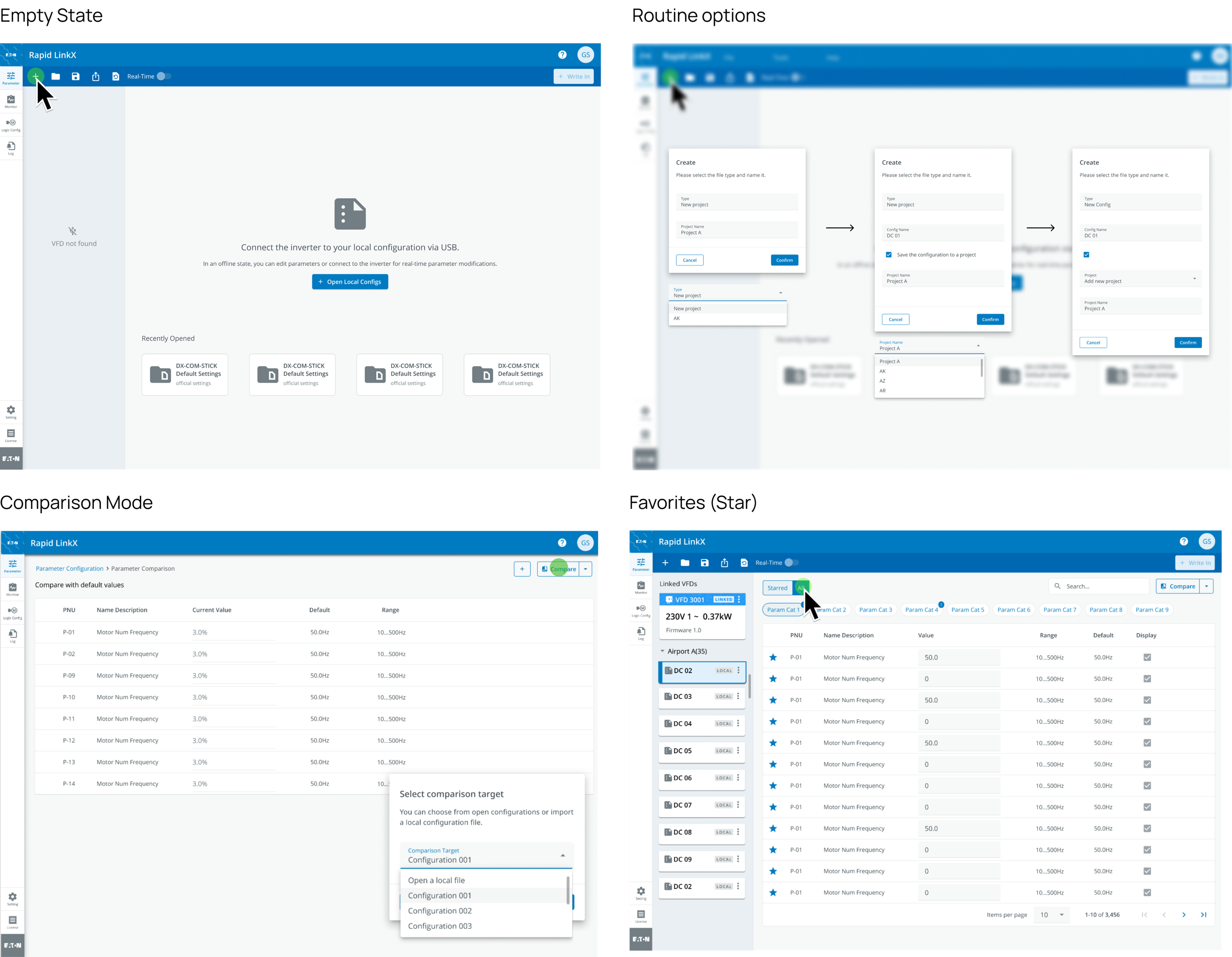
- Empty state. With nothing connected, a prompt to connect an inverter over USB, and the most recent files beneath, so an engineer is back in the last configuration straight away.
- Routine options. Presets of parameters can be created and saved, a new project and then a configuration inside it, and imported into a drive in one step.
- Comparison mode. A side-by-side of a past dataset and the current one, against the defaults, an open configuration or a local file, for analysis and for working out a fix.
- Favourites. The parameters that matter most on a configuration check are starred; All lists every parameter, 3,456 in this drive, in nine categories.
2Writing to a drive
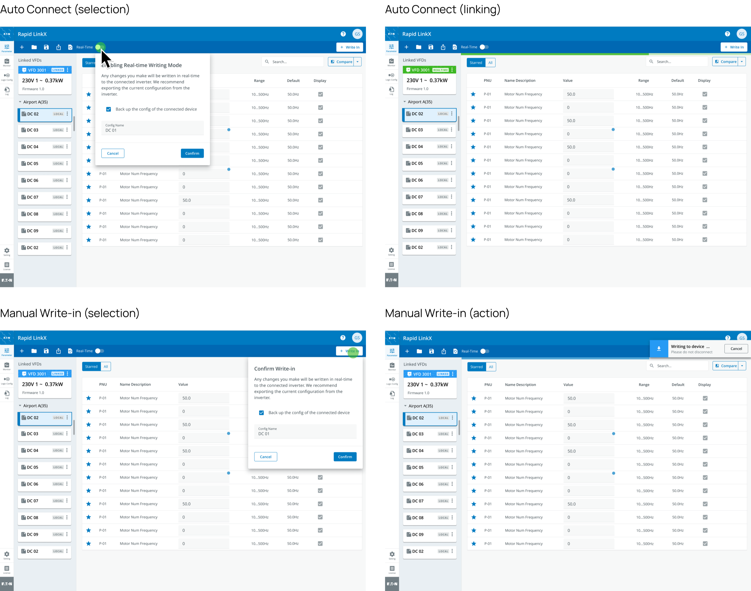
An engineer on a routine round wants the tool linked and watching. One at a drive that has just failed wants nothing written until they've decided what.
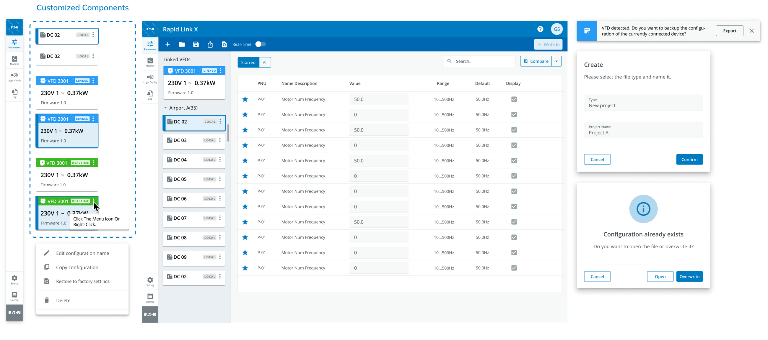
So real-time writing is a switch, and it's off when the tool opens. Turning it on, or pressing Write In, brings up the same confirmation, with a backup of the drive's current configuration already ticked. Once linked, the drive's card turns green and reads REALTIME; while a write runs, a notice at the top right asks not to disconnect, with Cancel beside it.
The two modes answer the situations our expert research described. Manual write-in gives the engineer control for routine maintenance and troubleshooting: when a drive on the baggage handling system fails without warning, the engineer connects by hand, goes straight to the diagnostics and the troubleshooting features, and resolves it there. Auto connect is for continuous monitoring and automated processes: on routine work such as watching the whole conveyor system, the tool keeps checking and raises an alert on any irregularity or likely failure without the engineer having to step in.
3The monitor, in colour
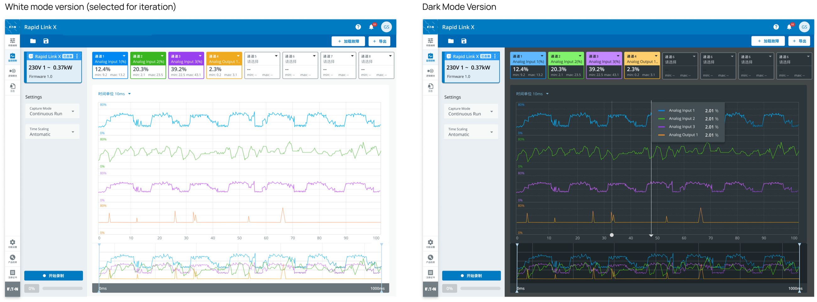
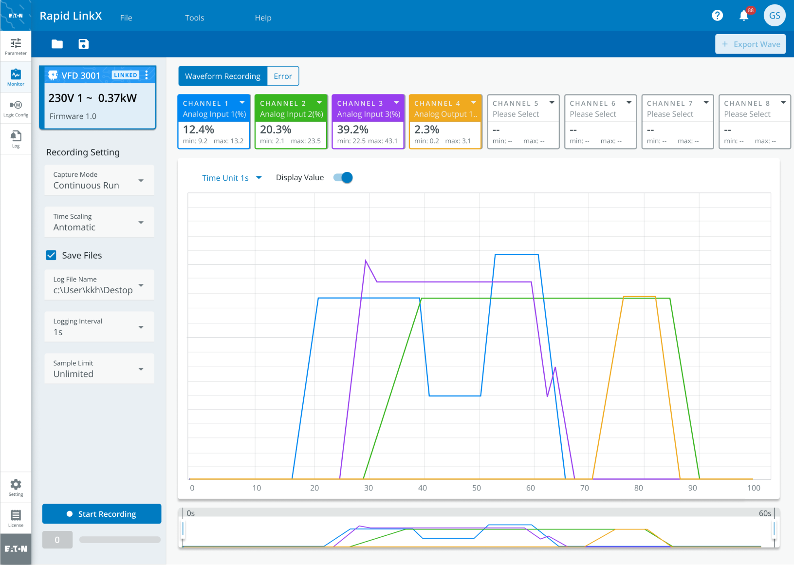
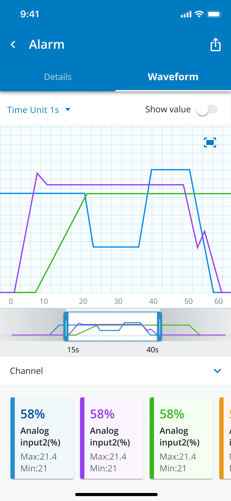
The same test set a text-heavy monitor against a colour-coded chart, and with the chart participants found errors 40% faster. The chart I drew first gave each of the four channels an axis of its own, which is fine until a spike on one needs reading against the other three. The shipped chart puts the four on one axis.
Besides setting parameters, engineers need to watch the data to find errors quickly and accurately, for a fix later on, so the monitor was drawn twice, light and dark, with the labels still in Chinese at that stage. Dark reads better; light was chosen as the final design because it fits the overall design system, the Brightlayer theme the external developers were building from, and the system's colour scheme was adjusted slightly for readability.
The recordThe rest of the summer
The three decisions above are the case. What follows is what I recorded at the time: how the studio worked, what research we could do, the tool state by state, the test, the hand-off, and what I took from it.
4The two halves
Over the three months I designed RapidLinkX in two parts: a parameter editor for configuring a drive, and a monitor for finding and correcting faults. The work was stakeholder meetings, user research and prototyping, and it ran in parallel with the hardware.
The editor sets a drive's motor speed, torque and start/stop settings, and its automatic operation modes and schedules. An engineer can save a set of parameters as a profile and switch between profiles, so one tool serves the different material-handling lines a drive ends up on. The monitor detects and diagnoses faults in real time, alerts the engineer, keeps error logs with corrective actions, and lets the configuration be adjusted so the fault doesn't come back.
5The studio, and everyone the tool answered to
In 2022 I joined Eaton APAC's newly established Human-Centered Design department as one of its first UX interns, and was given a high-priority project: a ground-up design for a parameter-editing IoT product aimed at airport markets worldwide. Eaton, a global power-management company, was modernising its product experiences by pairing its business departments with the new design studio, Studio Blue, which worked like an internal design consultancy. The product team made the request, but the people with a say in it were an external development team, the in-house engineering and market teams, our direct clients and their secondary dealers, spread across the business, product development, sales and marketing teams of the APAC region. Before any design started, we had to find a way of working that would move the project through all of them.
I was the primary designer on the day-to-day product design; my mentor's role was task planning and cross-team communication. Wanting more of that experience, I planned my own schedule and met her regularly to go over the collaboration, the research and the design. We set the strategy together, and I took the lead in carrying it out.
6Workshops and the work map
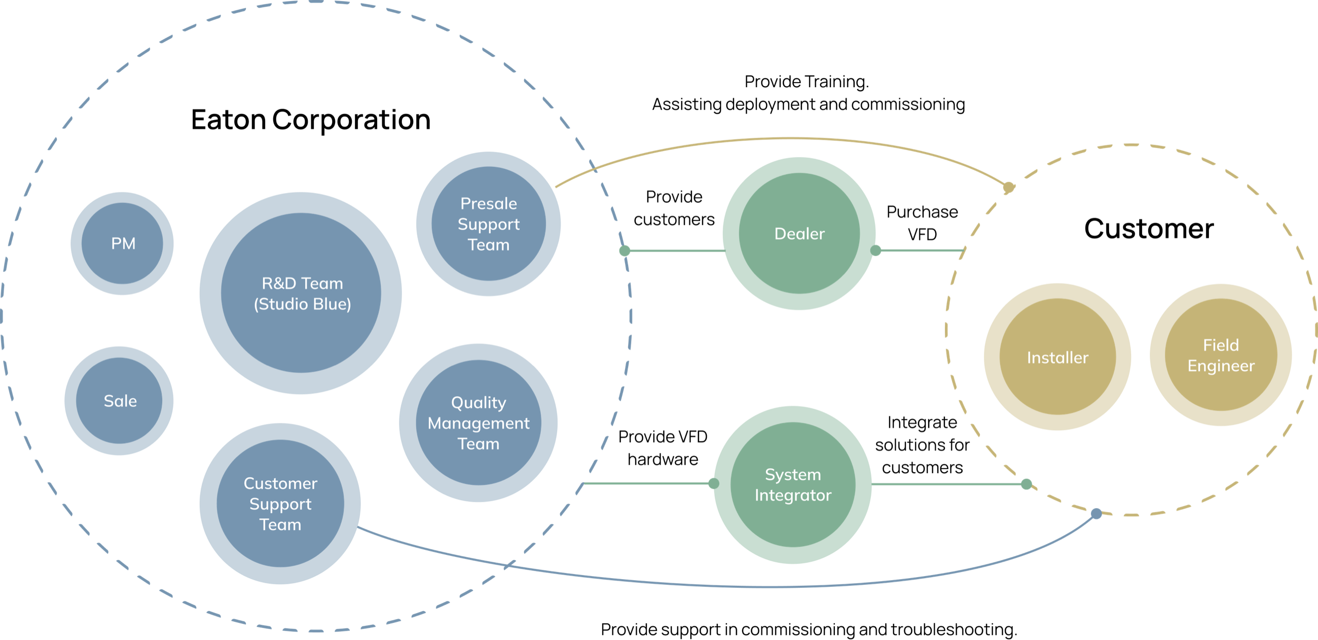
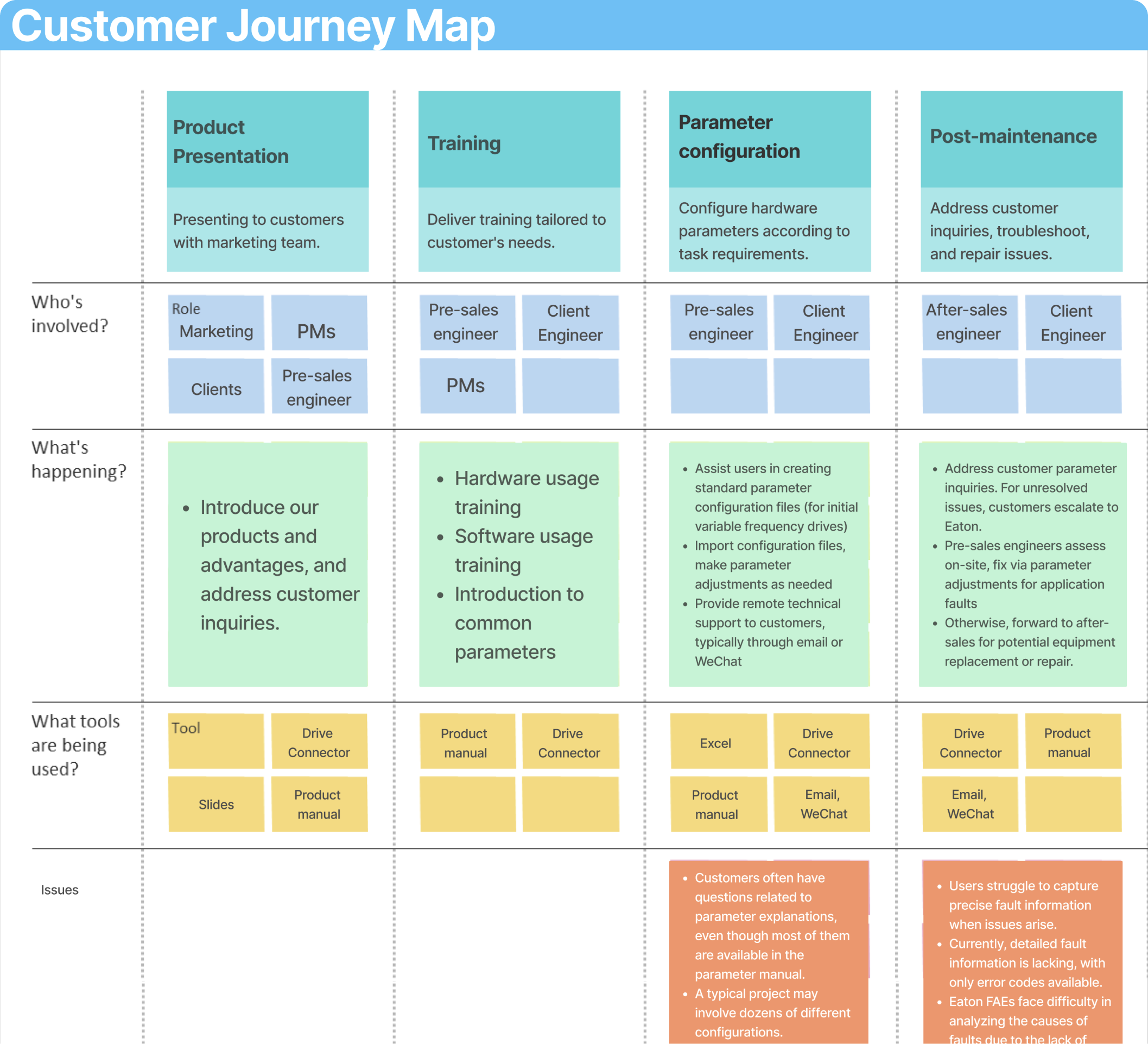
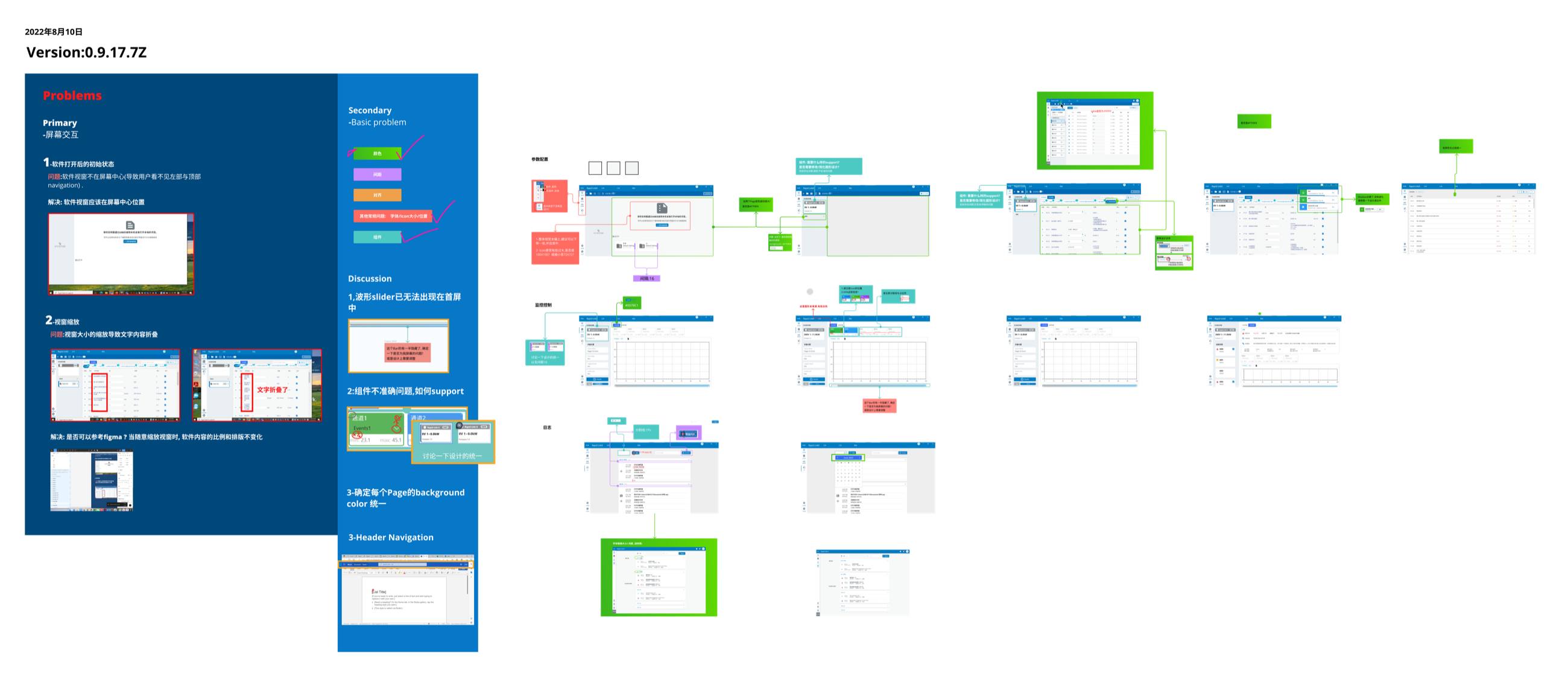
To move the project we held several design-thinking workshops, so that partners and clients took part in the design decisions and understood every phase from R&D to launch; it improved communication across all the teams. To make the plan clearer and easier to remember, my mentor and I took the conventional UX journey map and redrew it around our collaborative context and each stakeholder's role, which made it an organisational chart as much as a journey. The work map that came out of it outlines the whole process and tracks every stakeholder's interaction with the product and with sales across the product's lifecycle.
7Research with limited resources
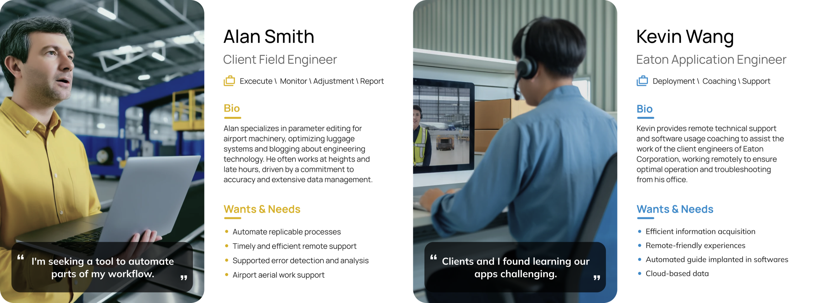
Pandemic restrictions limited our access to experts, so we turned to online secondary research and to what the stakeholders told us in the workshop to understand the target audience. From that came detailed personas, which guided the design and, as much, improved communication inside the company: with the personas every team had the same picture of who the tool was for.
8The brief, and the scale of the work
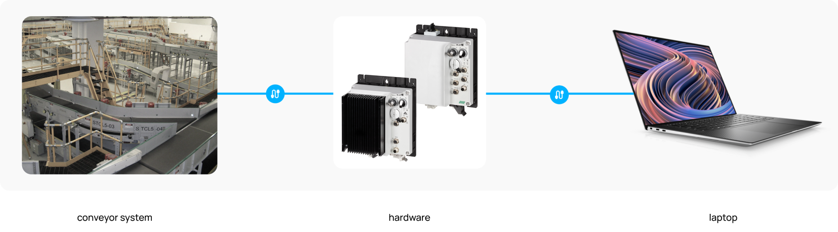
The question we set ourselves: how might we create an intuitive tool that lets airport engineers detect hardware issues quickly and resolve them efficiently, minimising downtime and improving operational efficiency? The design goal under it: an IoT dashboard on which an airport engineer completes the parameter settings and performs the error checks for a conveyor system. The drive sits between the conveyor and the engineer's laptop, connected over USB.
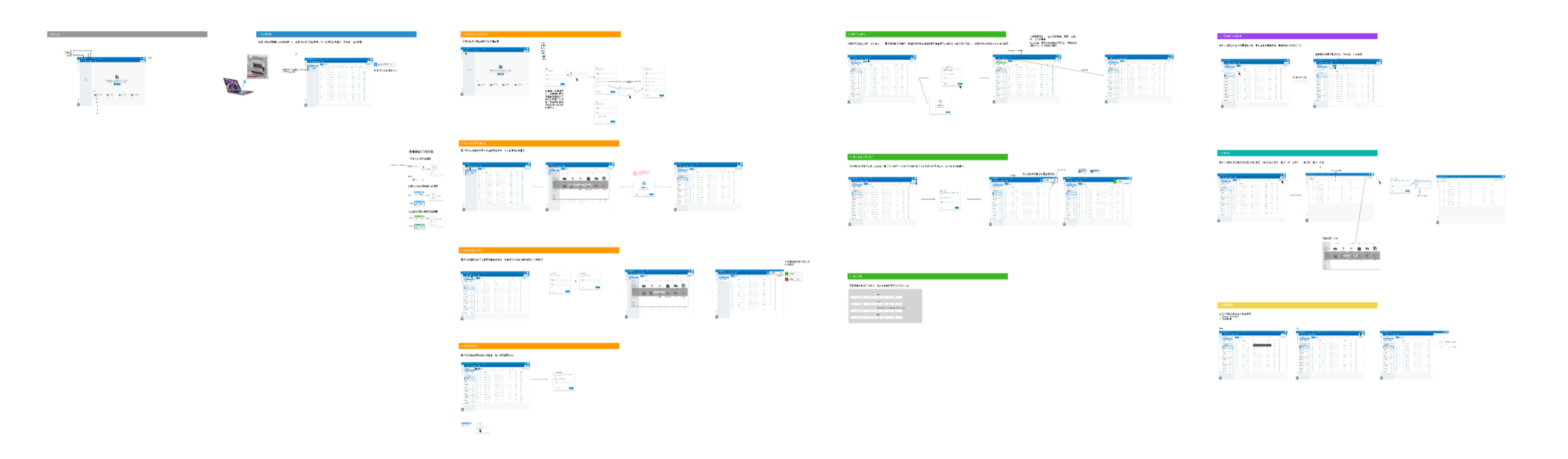
The UX design ran in parallel with the hardware's design and production. Our scrum workflow had a weekly or biweekly review with the hardware product team, so the design tracked the hardware as it changed, and we ordered the work by the importance of each workflow. More than 60 hi-fi pages were designed during the internship, of which 35 selected pages cover over 10 distinct workflows. Under Eaton's NDA, only the parts that have launched are shown here.
9The core panel and the components
The design starts from the fundamentals of how a page operates, how it's organised and how it's managed. On that base we customised specific components from Eaton's existing Brightlayer design system to present the data the tool needed, and what the system didn't have became 14 component variants added to it.
10The monitor, state by state
With the version chosen, we turned to the functions that matter for operational efficiency: a close reading of the workflow for bottlenecks, and priority to whatever took manual steps out and made the state of the system easier to see.
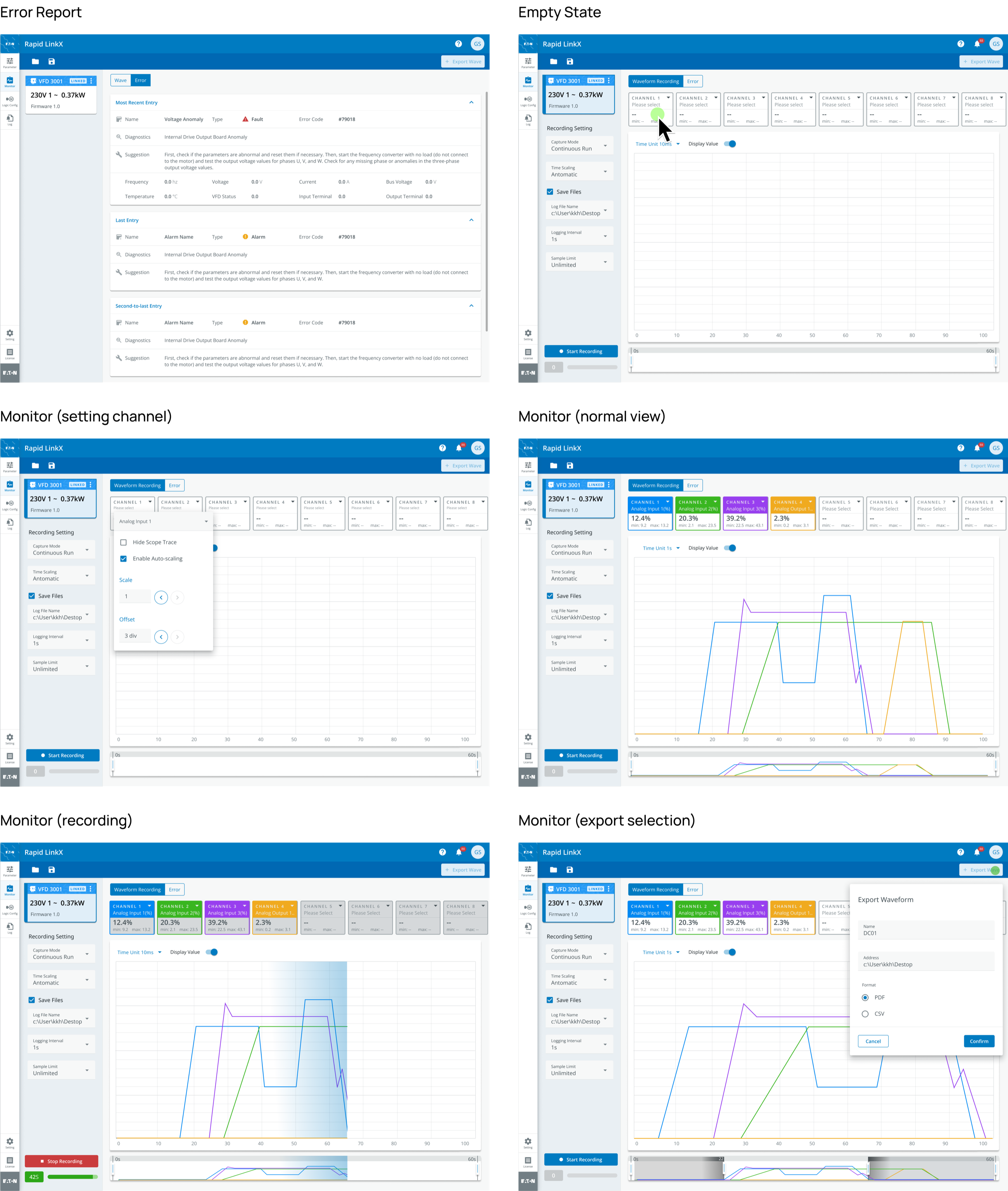
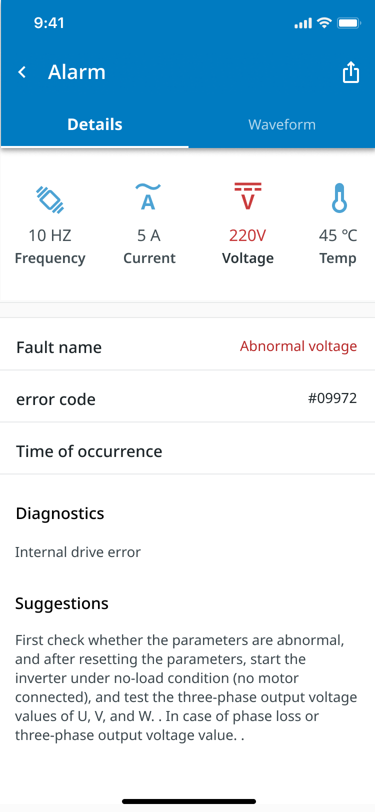
- Error reports. Alert the engineer to a malfunction or a discrepancy, with a detailed breakdown and possible solutions: the most recent entry, a fault with its code, diagnostics and a suggested fix, then the entries before it.
- Empty state. When no file is open or a session starts, eight empty channel slots over an empty grid lead straight to setting the monitored channel.
- Setting a channel. A popover on the slot: the input, hide scope trace, auto-scaling, scale and offset.
- Normal view. A real-time overview of the system, so the engineer keeps a constant read on current states and parameters without opening deeper views.
- Recording. Records the live data stream for detailed review and historical analysis, a band sweeping the plot and a counter running; what lets an engineer trace the events before an error.
- Exports. Data and reports in several formats, PDF or CSV over a selected span, to share across departments or with external stakeholders.
11The comparative usability test
We ran a comparative usability test on the two halves of the tool. For parameter editing, the conventional form layout against an interactive drag-and-drop interface; for monitoring, a detailed, text-heavy format against our graphical, colour-coded design. Participants were divided into two groups, each working with one version, and we collected task completion times, error rates and satisfaction through surveys and direct observation.
Two things came out of it. Safety before efficiency: the drag-and-drop interface cut the time to complete parameter settings by 35%, and raised the error rate by 15%. Where a small mistake can carry a large financial cost, that trade-off decided it, and the slower, conventional layout was adopted for its lower error rate. And the colour-coded monitor: with the graphical dashboard, engineers identified errors 40% faster than with the text-heavy format. The visual cues and the simpler presentation made real-time monitoring more intuitive and decisions quicker; the engineers reported less cognitive load and anomalies easier to spot, which is what keeps an airport system running.
12The hand-off
In the last six weeks of the internship we worked closely with the development team to deliver the designed features and workflows. The developers were contractors unfamiliar with Eaton's design system, which raised the amount of communication the work needed, so we established a structured communication protocol, and introduced an annotation process for each phase to keep the delivery clear.
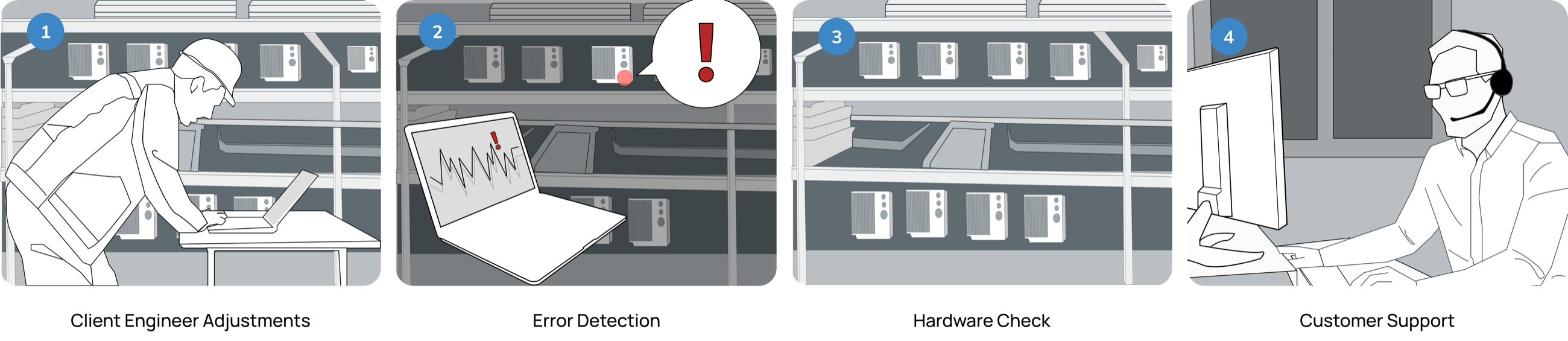
13A storyboard for the department
As the project neared its end and we prepared a department-wide presentation, our product manager raised a concern about how the design would transfer across different sections. Diagrams wouldn't fully answer that, so we presented with storyboards: a format every stakeholder could read, which put the UX workflow in front of them as a sequence rather than a chart.
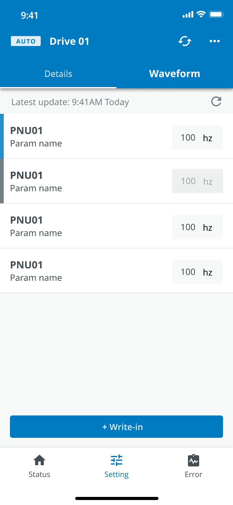
14A mobile version, for work at height
This was our APAC team's first physical product, and since the studio was founded to digitise Eaton's product ecosystem, we tried to make the most of it. The scope was desktop only at first, because the tool depends on USB and a hardware connection. During the design we found scenarios that involve work at height, where a USB-only connection doesn't serve. After long discussion with my mentor and our design manager, I was entrusted with starting a mobile, Bluetooth-based solution, with future cloud data integration in mind. In my final days I started it and iterated on it, and left prototypes and detailed documentation for my mentor and the interns who'd follow.
15What I took from it
At Eaton the role went beyond UI and UX craft into driving the team's performance: reading a domain quickly, structuring its information, taking its workflows apart. Those are what deliver specialised, stable, predictable results, and recognising that was the main thing I learned in the three months; it's what let me meet complex requirements consistently.
Working remotely added a second lesson. Keeping onsite levels of efficiency takes planning, communication and coordination, and effective design in that setting is closer to careful management than to sheer effort. I made a habit of meeting my manager's expectations efficiently, keeping the team informed, and going to get the resources a design problem needed. Those habits are what made me reliable on the team.
A wrong value was the expensive thing.
The slower form keeps most of them out, and the chart is there for the ones that get past it.