Heygen · Product Design Intern · June – October 2023
The video editor, re-architected around the script.
Customers were making videos of several scenes in an editor built for one script on one page. I rebuilt it around the script. Three decisions carried it, and a usability test settled the third.
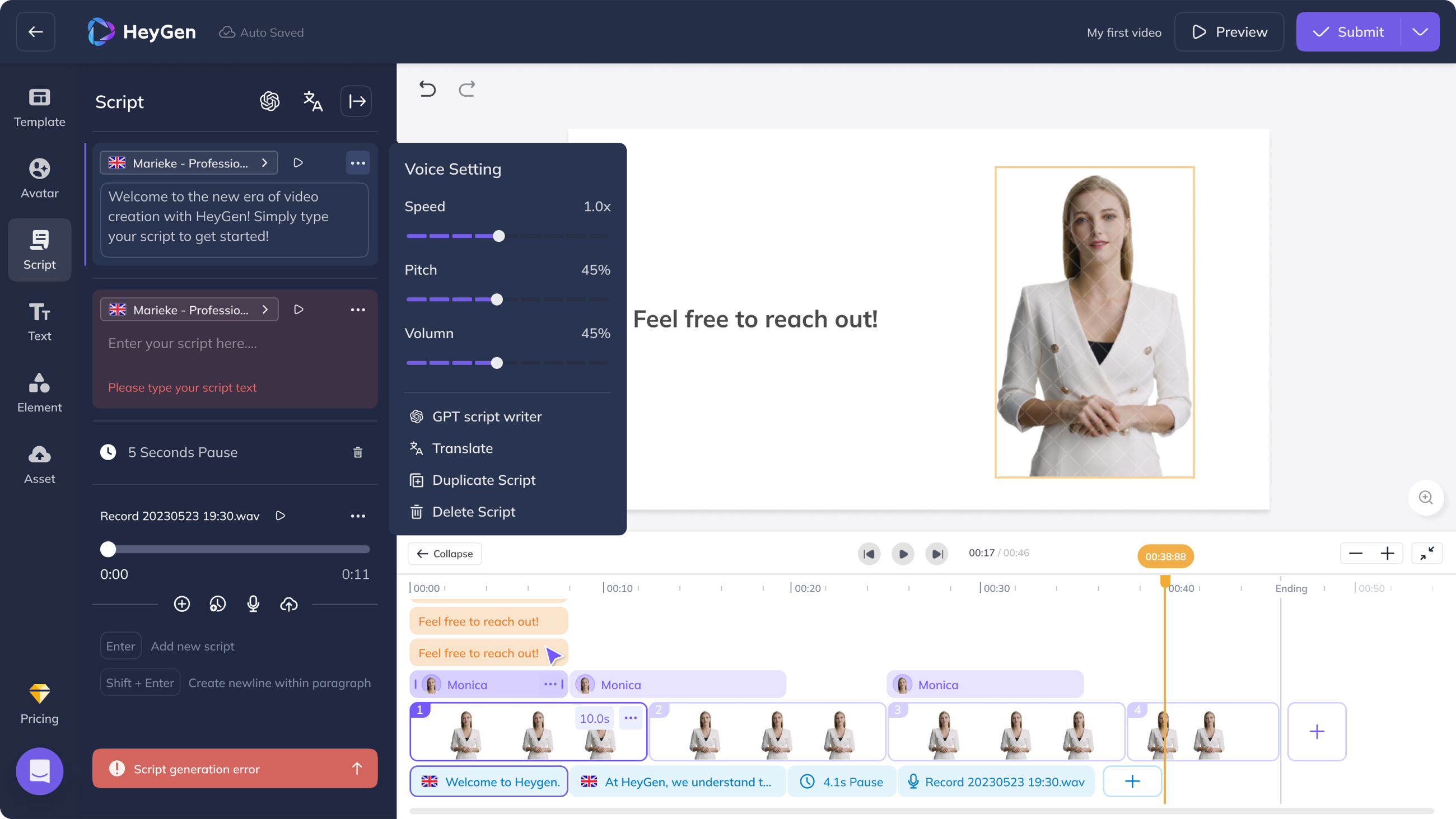
- The desktop editor, as its only designer: the script panel, the timeline and an updated component library; then an iOS MVP in the last three weeks, which stayed a prototype.
- Three rounds of interviews with 24 clients, a survey of 328 people and seven competing editors before the design; six rounds of internal evaluation and a usability test with six agencies and four creators during it.
- Engagement +32.1% and task completion +24.3%, Heygen's numbers for the new editor against the one-page flow it replaced.
Why one page stopped working
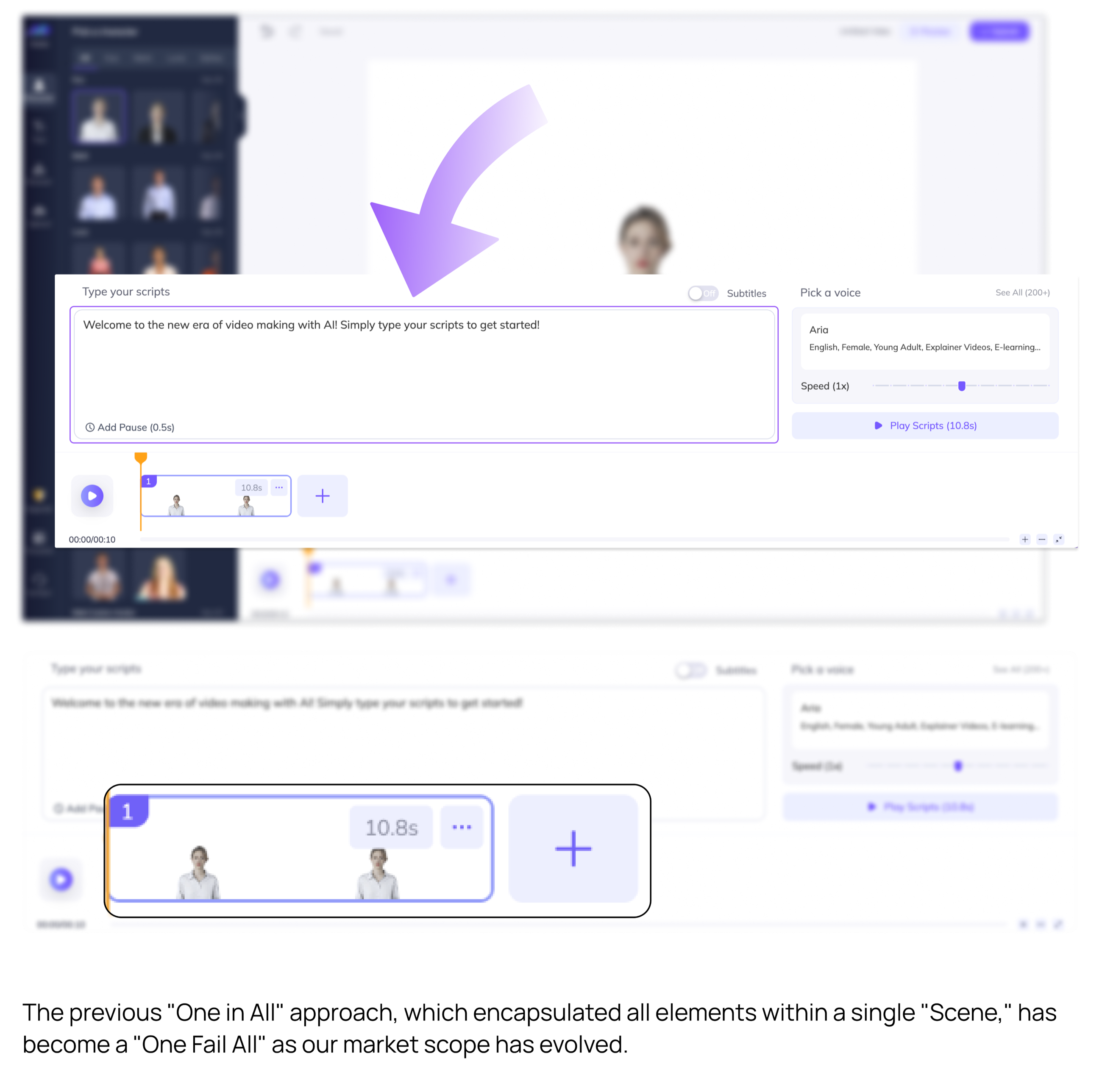
Everything happened on one page: one box for the whole script, one voice for the whole video, and a timeline that was a card, a play button and a readout. That was the point, nothing to learn. It held until customers were making videos of several scenes, each with its own lines, and one box with one voice couldn't hold them. Text-to-speech was still the core of the product, so whatever replaced the page had to give the script more room, not less.
1Where the script lives
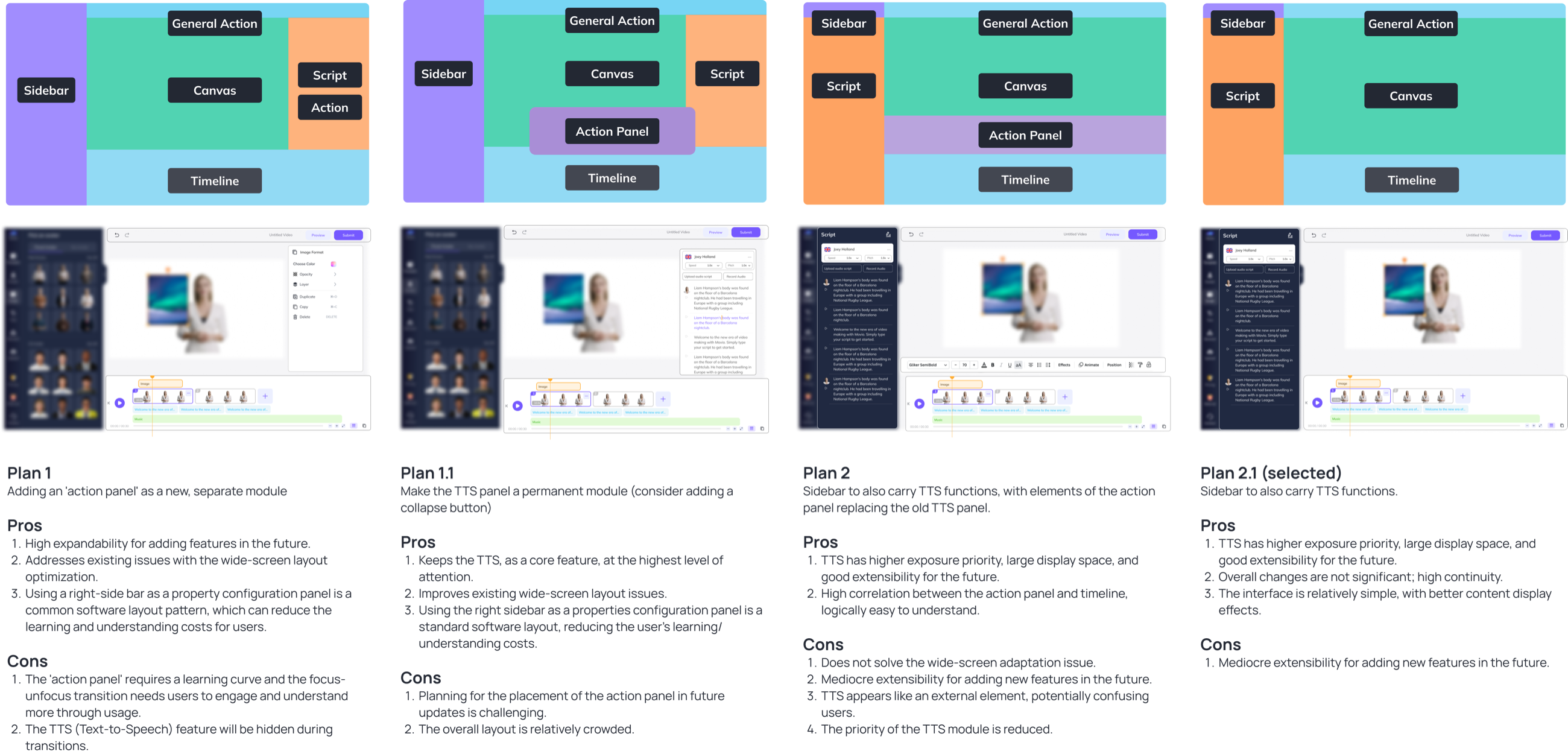
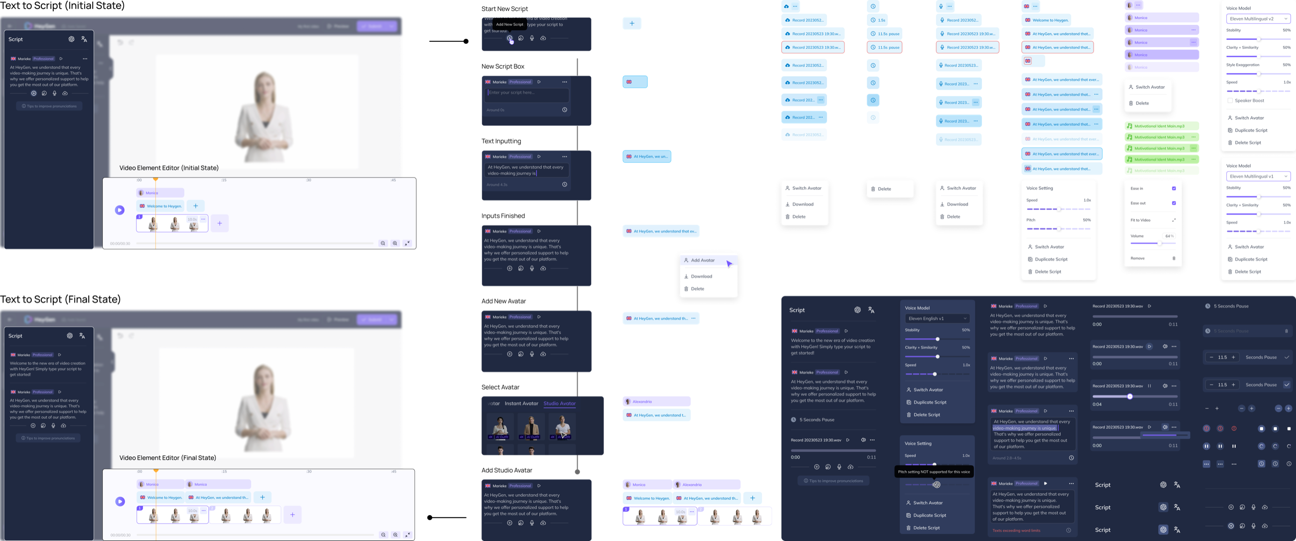
The timeline needed the bottom of the page, which freed the script's old spot. Of the four layouts I drew, two put the script in a new panel on the right, with room for tools to keep arriving, and two kept it in the sidebar as a tab beside Avatar, Text and Element. I chose the sidebar and moved nothing else: less room for whatever comes next, but an existing user could open the new editor and still know where they were. It went to engineering drawn state by state, from the empty card to a script over the word limit, with the updated component library.
2A timeline that shows time
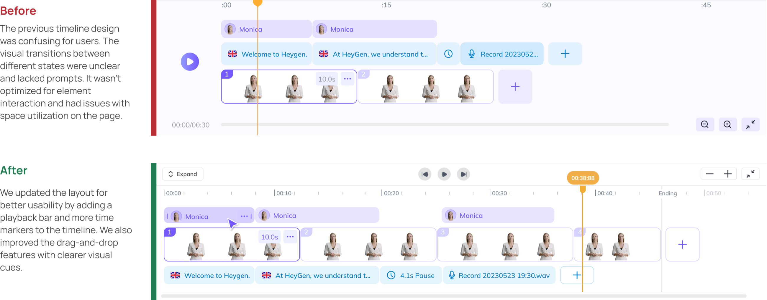
My first pass gave the timeline three tracks, for the avatar, the scenes and the script, with a mark every fifteen seconds, and that's what we put in front of agencies and individual creators. People couldn't tell what they had selected, and a scene's place in time was still a guess between the marks. So the shipped timeline reads as time first, with a ruler and the current time on the playhead, and whatever appears in two panels stays in sync: select a scene in the timeline and it lights up on the canvas.
3The play bar, three times
In the first round I drew a play bar floating just under the canvas, and the round turned it down as too complex. So I went the other way and proposed dropping it altogether. The timeline had a playhead and a play button of its own, and one control fewer would read as simpler. That's the version we tested, and people went looking for a play control above the timeline and didn't find one.
Previewing is constant in this editor, fix a line, play it back, fix the next, and a play button down beside the tracks sat too far from where they were looking. I put the bar back as a slim row between canvas and timeline, the transport buttons in the middle of it and the zoom controls at its right. That's the version Heygen measured against the one-page flow it replaced: engagement up 32.1%, task completion up 24.3%.

The three decisions above are the judgement. What follows is the work they came out of, in the order it happened: the four months, the research, the sprint and the iterations, the test, the hand-off, and the iOS MVP that came last. The numbers in it are from the notes I kept at the time.
Part 1June to October, in four pieces
In 2023 Heygen was a video generation company of about 25 people whose annual recurring revenue had gone from zero to $18 million. Like most companies growing that fast, it needed its product rebuilt for the customers it now had. From June to October I worked on the desktop product, on mobile, on PRDs, and on the design system that held them together, with the product and development teams, mostly on existing workflows that had to change.
The editor revamp
Our customers were becoming more numerous and more professional, and the old editor workflow was retired. I led the revamp of the video editor around the new AI-powered text-to-speech workflow, with the design system upgraded for the states the editor now had to cover. The editor itself is the first screen of this page; the three decisions above are the heart of it, and the research and the iterations that produced them follow.
The onboarding redesign
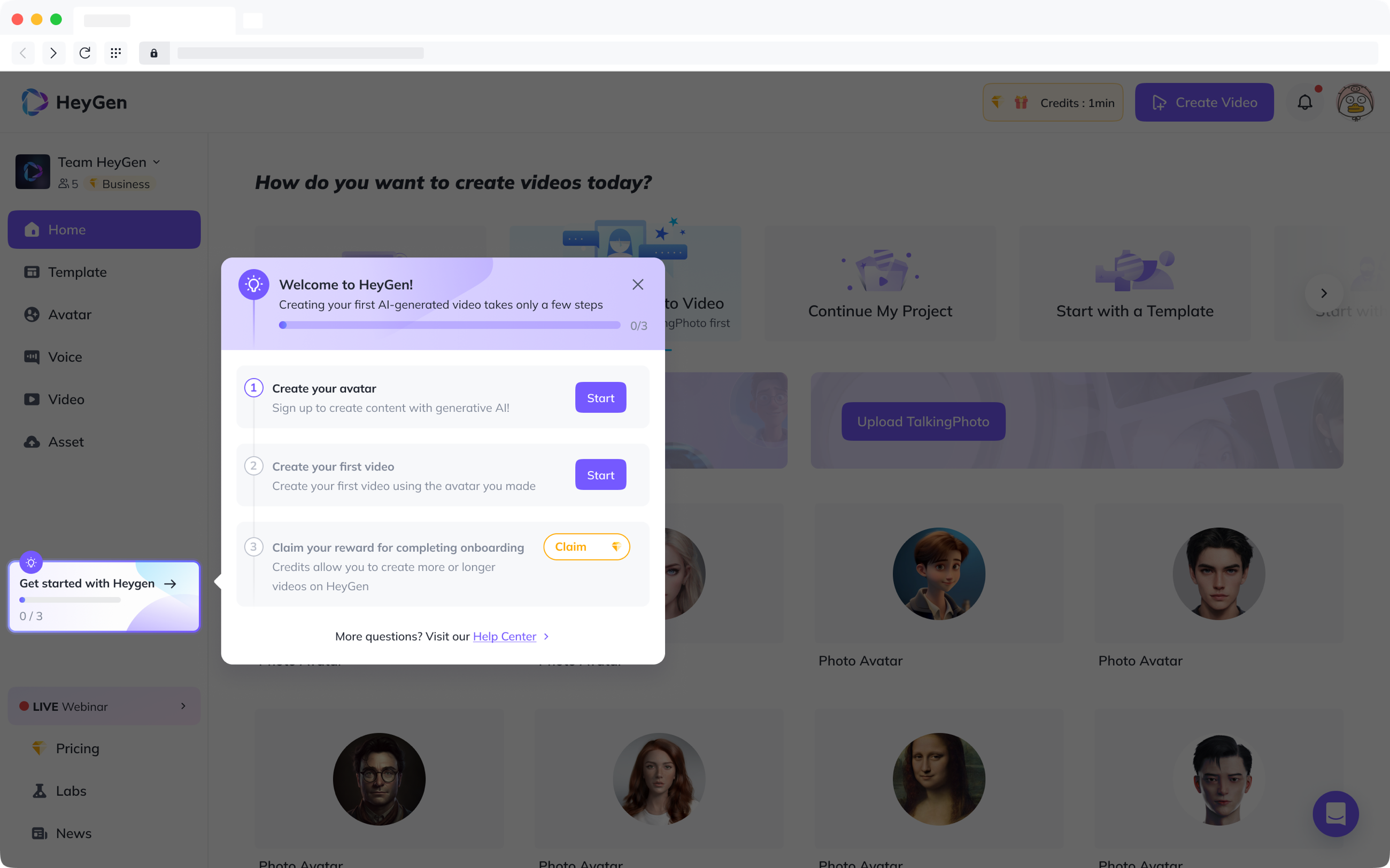
In the survey, 91% of respondents said they had found it difficult to onboard to Heygen's creation system, which is complex. New users needed a guide with some motivation in it. I designed a step-by-step guide with a gamified reward at the end: three steps, a progress bar, and credits for finishing, which the guide carries with it as a small card in the sidebar. It went out with an 18.1% boost in new user retention.
The iOS MVP
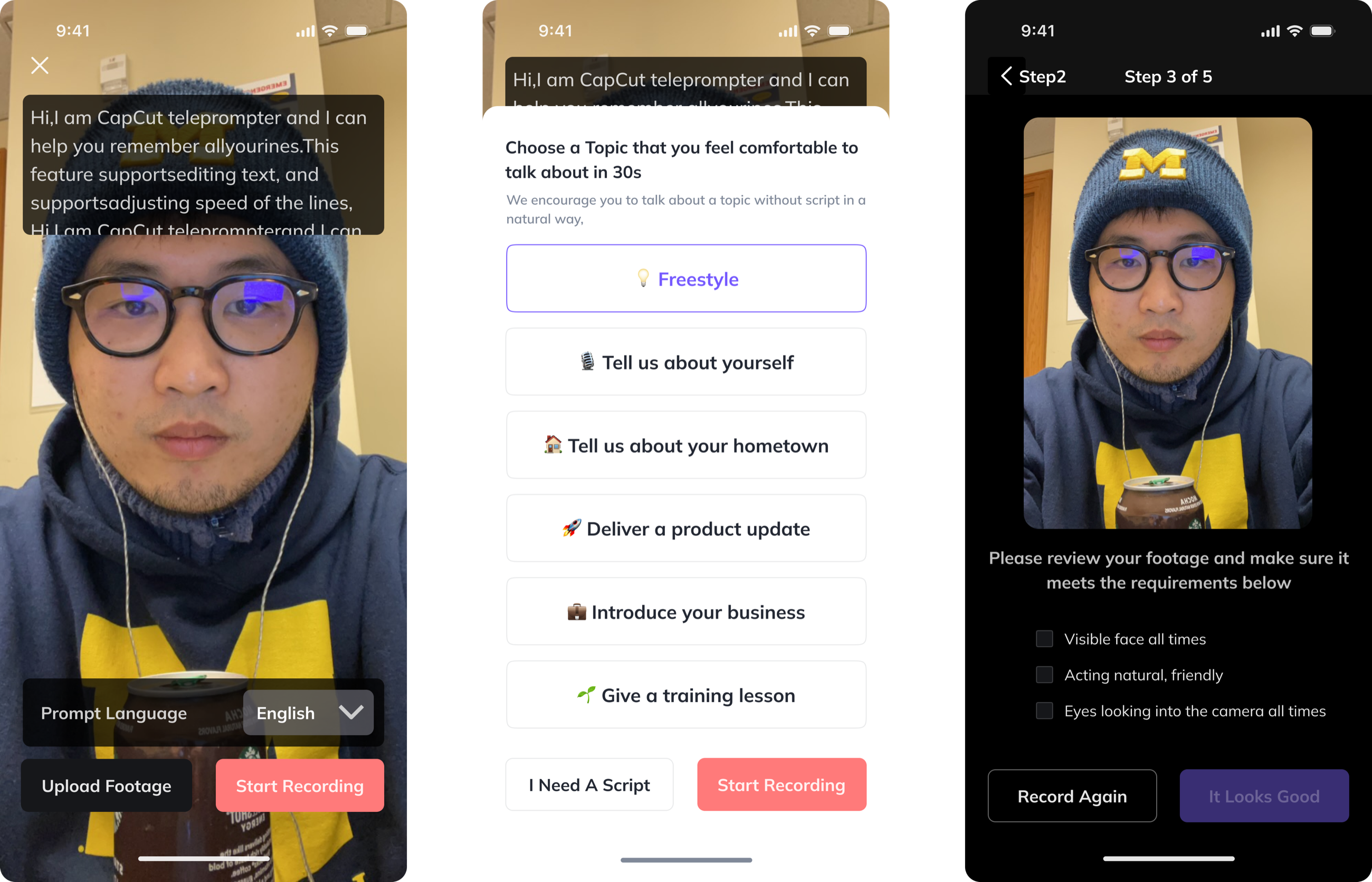
Heygen's service is built on AI avatars, and every avatar starts as a recording. I was responsible for the mobile MVP, which was to use the high-quality cameras on smartphones to improve that recording. It is told in full in Part 6.
Ten smaller projects
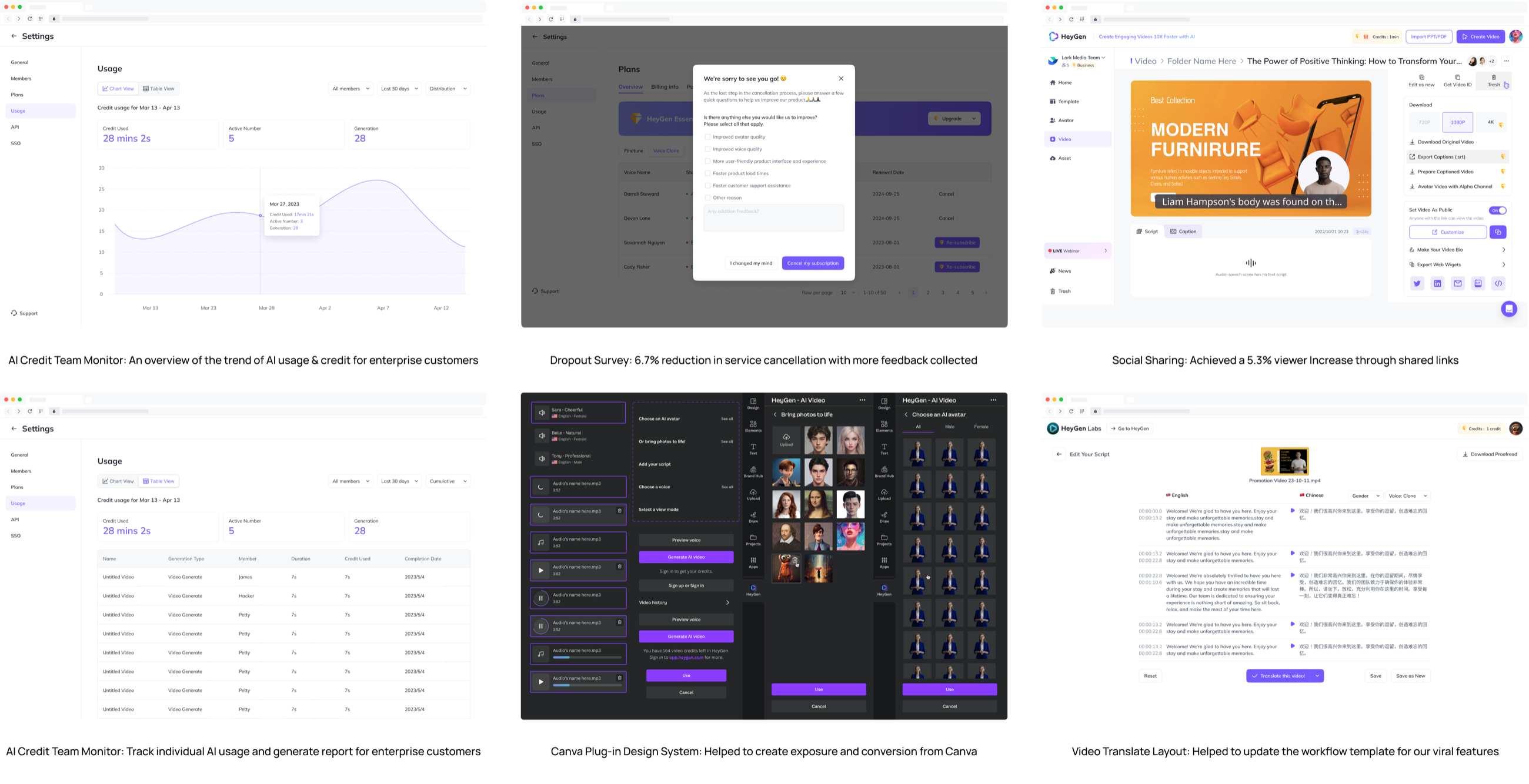
Alongside these I worked with the other designers on more than ten projects, building on their earlier work rather than starting over: an AI credit monitor for enterprise teams, as a chart and as a table; a dropout survey shown at cancellation, which reduced service cancellation by 6.7% and collected more feedback; social sharing, which brought a 5.3% increase in viewers through shared links; the design system for the Canva plug-in, for exposure and conversion from Canva; and the layout of video translation, a workflow template for one of the product's viral features. Working from each other's strengths and insights made the designs more refined.
Part 2Why the product had to change
The customer base had grown and matured past the scope the product was made for, so the product had to be modified to meet what those customers now needed and expected.
A customer base the product wasn't built for
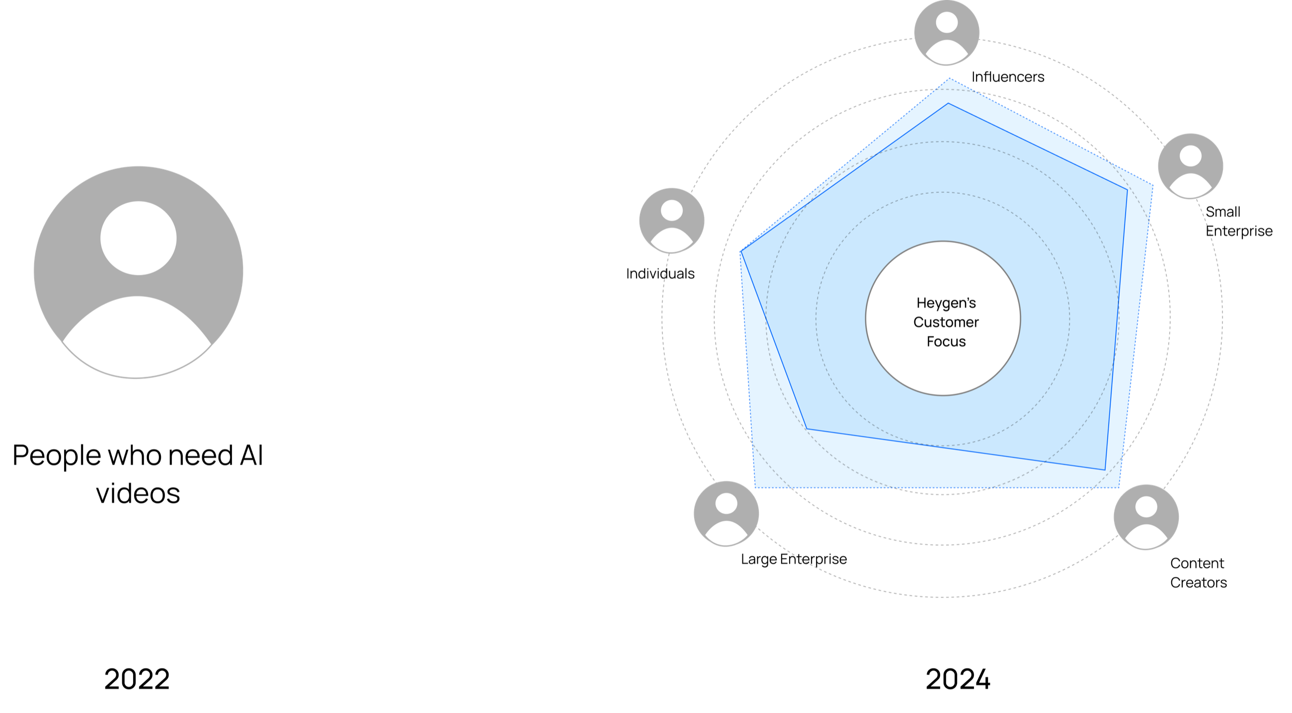
In 2022 Heygen served one kind of customer: people who needed an avatar-based video. By 2024 that had diversified into individuals, influencers, content creators, small studios and enterprises of every size, each pulling the product's focus a different way.
What each kind of customer needed
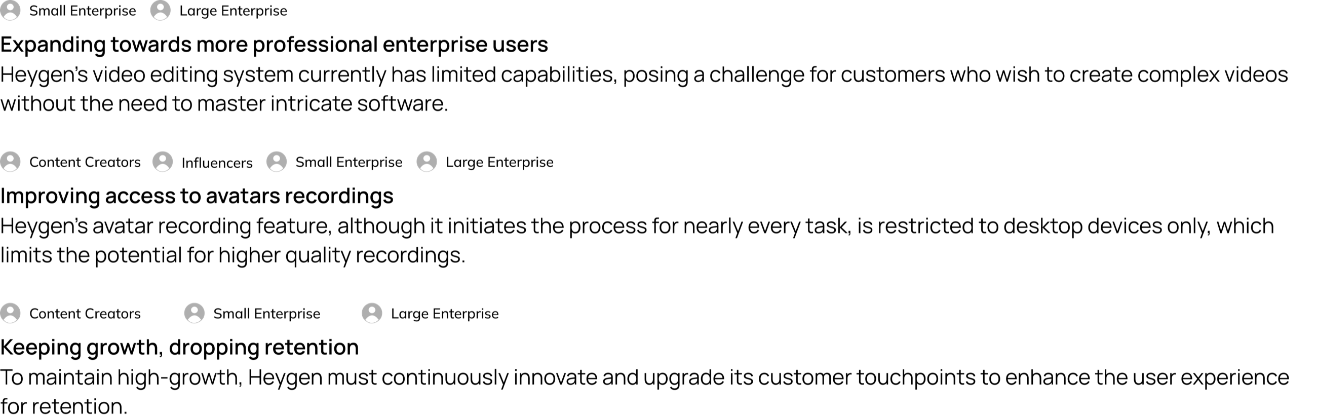
Three things followed from the growth. Small and large enterprises wanted to make complex videos without mastering intricate software, and the editor's capabilities were limited. Creators, influencers and enterprises alike began nearly every task with an avatar recording, and recording was desktop-only, which capped its quality. And to keep growing, Heygen had to keep upgrading each customer touchpoint, because retention was dropping. Understanding the customer journey and where it touched the product was how we tailored the work to the new context.
How a designer worked at Heygen
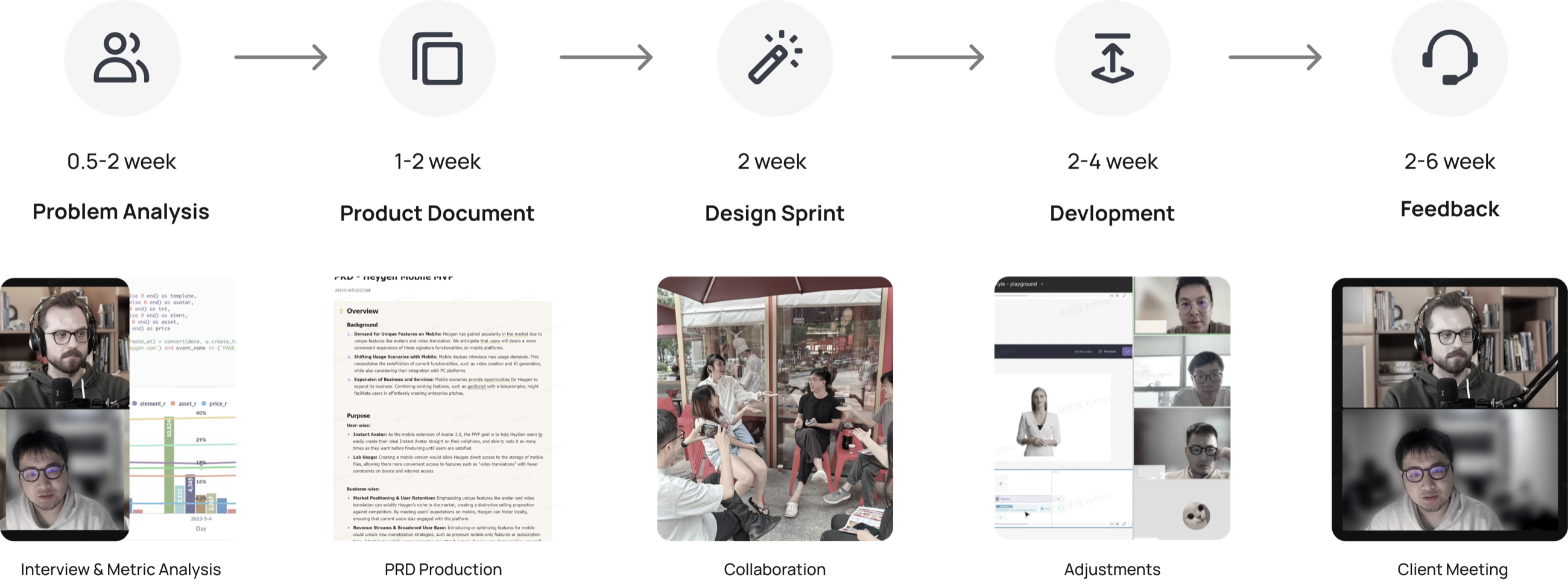
Heygen's growth pushed the work past the usual boundaries of the role. Designers made interfaces and also took on product research and product management, which let us respond quickly to what users needed. A project ran through problem analysis (half a week to two weeks), a product document (one to two), a design sprint (two), development (two to four) and feedback (two to six), with interviews and metric analysis at the start, the PRD as the record, and client meetings at the end.
The question
How might we help people create and manage videos on Heygen's platform with ease, so that the experience is enjoyable and efficient for everyone, from beginners to experts?
Part 3The editor: research
The design goal was to redefine the video editor's structure to support the diversity of video creation. Before any drawing: the editor as it was, seven competitors, three rounds of interviews and a survey.
One page for everything
Heygen's two main services are creating AI avatars and turning audio into video. In the past the editor put every interaction on one page, to keep the learning burden low. As the market moved, that became the problem for professional users who wanted to make more complex and more creative videos: the one-in-all approach, which put every element inside a single scene, had become one-fail-all. The page as it was is under the first chapter above.
Seven competitors
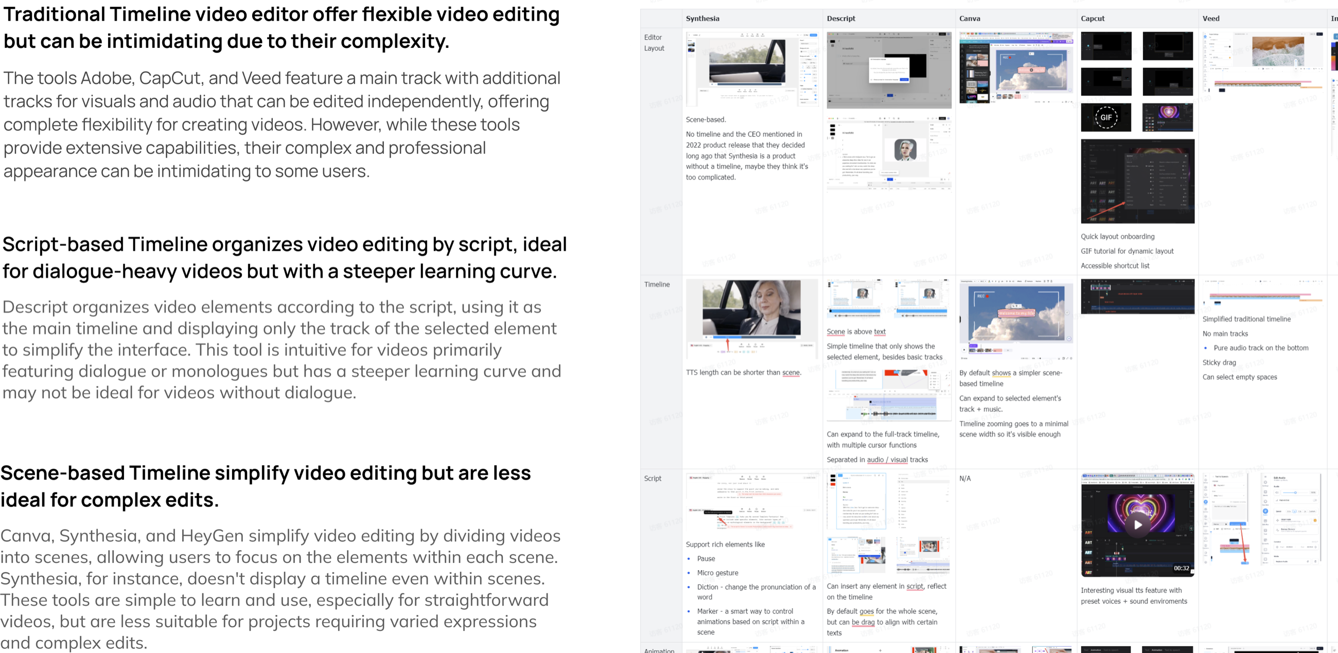
For a baseline of the market for video editing tools I analysed seven of them: their features, structure, interface, and fit for different kinds of editing. They sorted into three kinds. Traditional timelines (Adobe, CapCut, Veed) put a main track with separate tracks for visuals and audio that can be edited independently: flexible, and intimidating in their complexity. A script-based timeline (Descript) organises the edit by the script and shows only the selected element's track: right for dialogue-heavy videos, with a steeper learning curve and little use without dialogue. Scene-based tools (Canva, Synthesia, and Heygen itself) divide the video into scenes: easy to learn, and less suited to complex edits; Synthesia doesn't show a timeline at all.
Twenty-four clients, 328 surveys
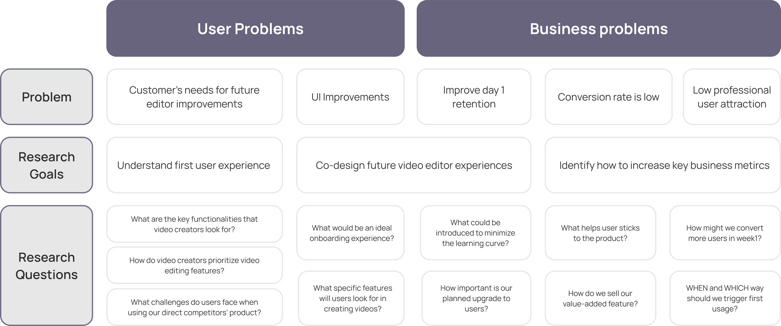
To get closer to what customers experienced and needed, we ran three rounds of semi-structured interviews with 24 clients, gathering the perspectives of both users and businesses, and 328 people completed a survey. The plan set the problems against the research goals and questions: on the users' side, what customers needed from the next editor and where the interface fell short; on the business's, day-one retention, a low conversion rate, and too few professional users.
In the findings, 85% of users found videos more engaging when they used diverse styles like A/B roll; 90% of creators said customization options helped the final quality; 75% liked a revamped layout with new features, because it simplified navigation; and 60% were concerned that too many new features would complicate the interface. The last two set the terms for the design: new features, in a layout that stayed simple.

Conclusion
The one-page editor had been the right answer before ChatGPT's release. After it the market accelerated: AI offered more, and more professionals chose AI video software. The solution was outdated and needed a systematic revamp to match the experience of the professional video editing apps.
Part 4The editor: design
From the sprint to the final design, in the order it happened: the layout, the components, the rules they were drawn to, the test, and what the test changed.
A design sprint, to agree on the problem
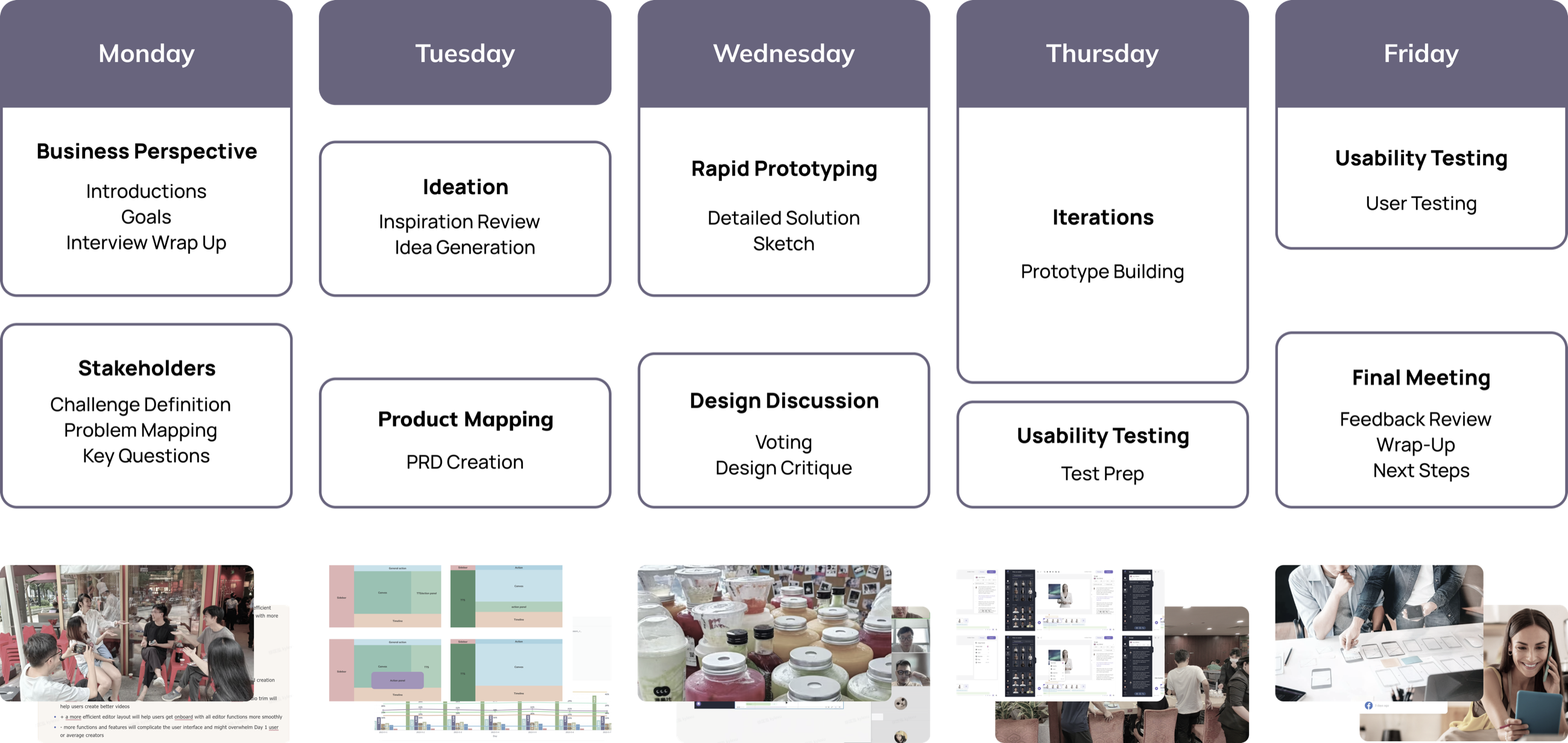
The project's details and scope were uncertain at the start, and the departments involved read them differently, so no consensus formed. As the only designer on it I was caught in a continual tug-of-war between those readings. I proposed a design sprint to align the objectives of everyone on the product and design teams and to establish a common foundation: Monday for the business perspective and the stakeholders, Tuesday for ideation and product mapping, Wednesday for rapid prototyping and design discussion, Thursday for iteration and test preparation, Friday for usability testing and the final meeting.
Information architecture
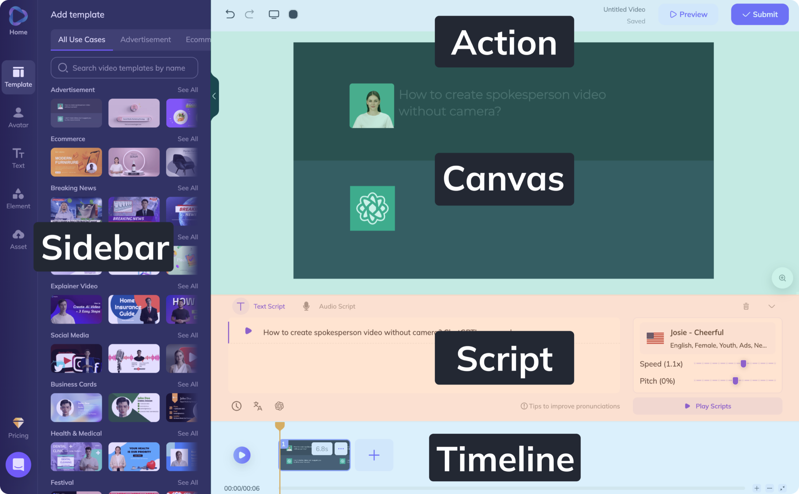
Before, during and after the sprint I led the iteration on two features, the script panel and the timeline editor. The objective was to redesign the page's information architecture so that the workflow of making a video improved. The old page had four regions: the sidebar, the canvas with its action bar above it, the script beneath the canvas, and a timeline along the bottom.
Layout: four plans
To revamp the layout I moved the text-to-speech functions, the script, into the sidebar, where they would be more visible and have more room, and weighed four plans, the ones drawn under the first decision above. Plan 1 added an action panel as a separate module on the right: expandable, and a standard pattern, but the panel needed learning and hid the script during transitions. Plan 1.1 made the script panel permanent on the right: the script stayed at the highest level of attention, and the layout got crowded. Plan 2 put the script in the sidebar and an action panel under the canvas: it didn't solve wide-screen adaptation, and it made the script look like an external element. Plan 2.1, the sidebar alone, kept the script's priority and display space and changed little else, so existing users would find their way; its one cost was less room for future features. The changes were meant to be minimal and effective, for a smooth transition and continuity for existing users.
Components: crawl, walk, run
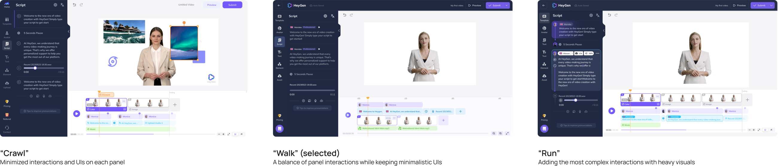
With Plan 2.1 chosen, we kept experimenting with the visual components and the functions attached to them, to make sure the redesign met its goals: better visibility and usability of the core features, the text-to-speech functions above all, and an interface that followed standard software layout patterns so there was less to learn. I drew the panels at three levels. Crawl, with the fewest interactions and the plainest interface on each panel. Walk, a balance of panel interactions with a minimal interface. Run, with the most complex interactions and heavy visuals. Walk was selected.
The design system
The initial design showed promise, but the new timeline panel had a learning curve, and essential functions such as the script needed to be easier to reach. I wrote a concise style guide for component interactions to make the vision clear to the development team. Three conclusions guided it.
- Define the boundaries between the operation panels clearly, using the contrast of white and dark modes to separate the sections of the page.
- Make every element single-attribute, operable and indivisible, with no automatic dependencies or bindings between elements.
- Synchronise the elements repeated across the timeline, script and canvas panels, so that when a user interacts with a photo in the timeline, the same element shows the interaction on the canvas.
Usability testing
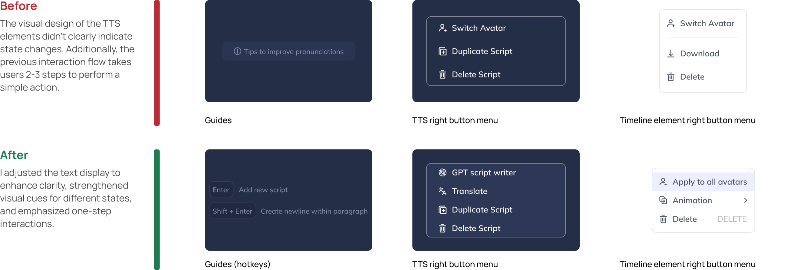
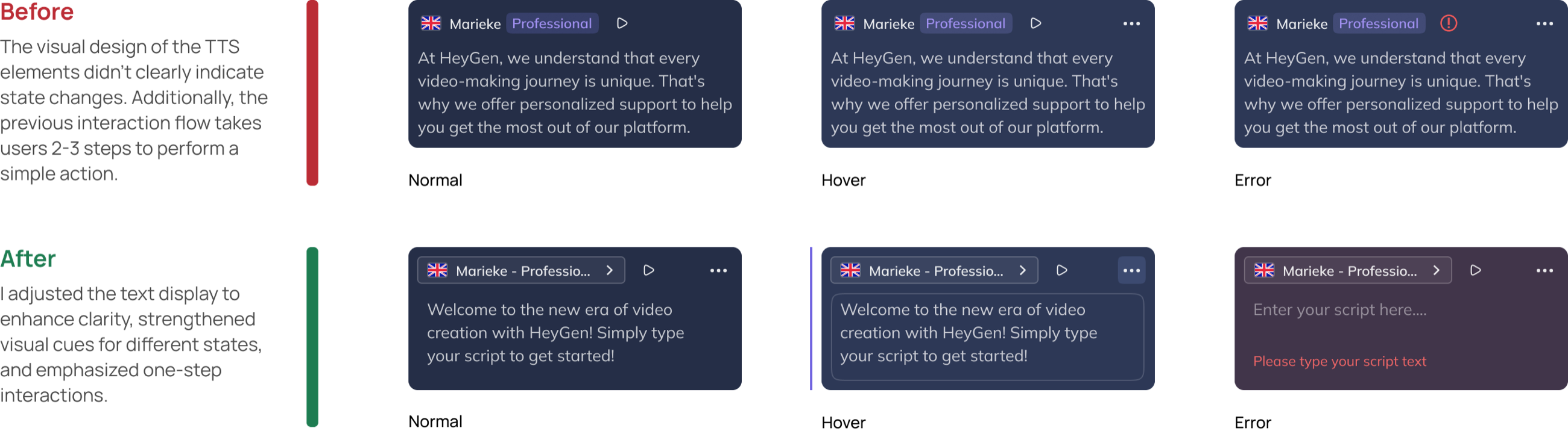
We ran client interviews with six agencies and four individual creators to test the features I had designed, for clarity, usability, completion and, above all, comprehension. Between the sprint and the hand-off the design also went through six rounds of internal evaluation. Three things changed. The timeline had been confusing: the transitions between states were unclear and unprompted, it wasn't built for interacting with elements, and it used the page's space badly; the update added a playback bar and more time markers and gave drag-and-drop clearer visual cues, the before and after under the second decision above. The script's elements didn't show their state changes clearly, and a simple action took two or three steps; I adjusted the text display for clarity, strengthened the cues for each state, and made the interactions one step, with hotkeys in place of the old tips. And the script cards' normal, hover and error states were redrawn so that they could be told apart.
Final design
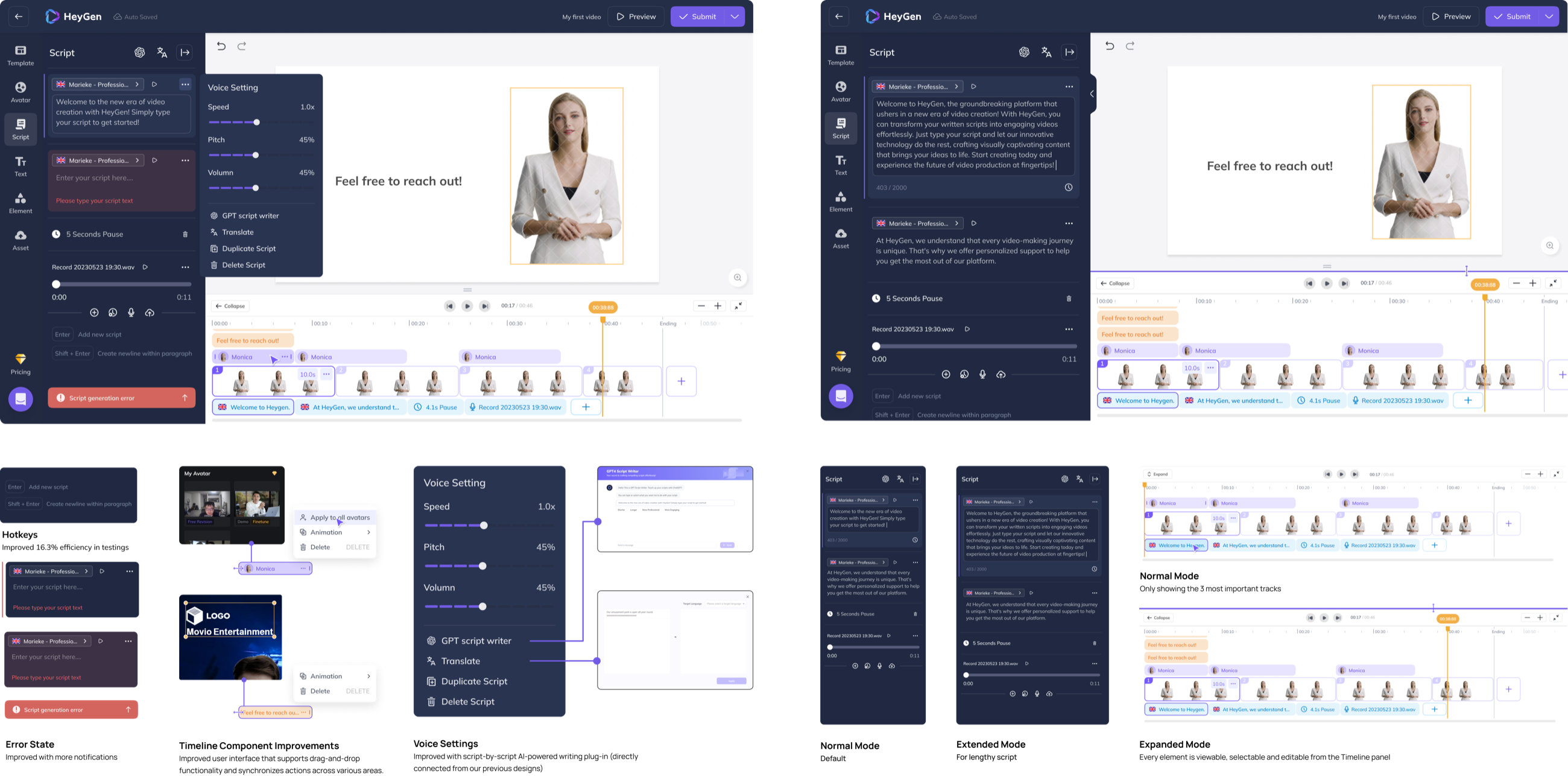
After the test the design was refined for clarity, with stronger visual cues for the different states and the text set for readability. The final editor has hotkeys for the script (16.3% more efficient in testing), an error state with more notification, timeline components that drag, drop and stay synchronised across panels, voice settings with a script-by-script AI writing plug-in connected to the earlier designs, and three modes: normal, extended for a lengthy script, and expanded, where every element is viewable, selectable and editable from the timeline.
"… It's getting so much more professional… This is gonna be a total game-changer for us! Now we can create high-quality videos way more efficiently without spending a fortune on hiring professional video makers."
Part 5The editor: hand-off
What went to engineering, and what I took from the project.
Design for development
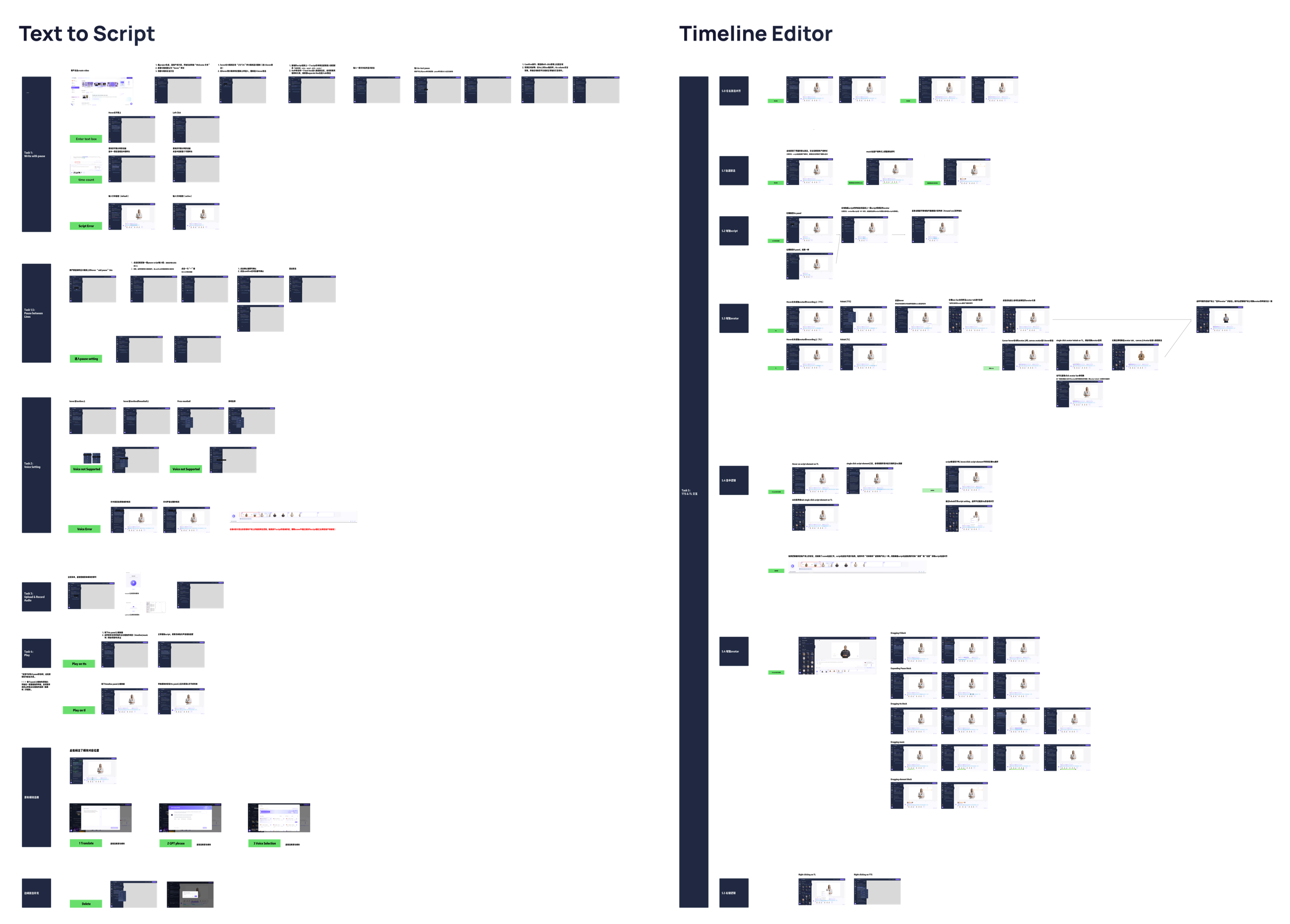
During development we worked on the interaction details of edge cases and workflows in detailed discussions with the product managers and engineers. Resources were limited, so each update to the design had to be incremental, manageable and verifiable, which kept the iterations moving and the cost of development down. The two flows, text to script and the timeline editor, went over drawn state by state, each task with its screens and the note that explains them.
Reflection
The project was intense. Besides the interface work there were research, evaluation and testing sessions with colleagues and with external clients, and with that many moving parts I learned how to balance efficiency against process in a fast-paced environment. The play bar's reversal, told above as the third decision, was the case in point: an idea set aside for simplicity proved essential once people used the editor, and staying flexible mattered more than holding to my earlier call.
Two lessons stayed. Move fast when the perfect answer isn't known: in that environment, striving for flawless design causes delays and misses opportunities, so we iterated quickly, learned from each version, and kept improving. And take in as much feedback as possible: as the only designer, regular feedback and evaluation from the team were how the design kept improving, and the outcomes I'm proudest of came through collaboration.

Part 6The iOS MVP
The design goal was to translate the desktop avatar recording feature into an MVP for an iOS app. Three weeks, from the first concept to a mid-fidelity prototype, and then a decision not to build it.
Context
Heygen's growth relied on its avatar service being easy to use and high in quality. Avatar generation was desktop-only, and many users had poor desktop cameras. To improve avatar quality and attract more customers, we proposed a mobile version that would use the cameras on smartphones; it could speed up customer growth and open new business. The desktop workflow was already a structured one, five steps from intro to submit, and the aim was to keep that structure on the phone and use what a phone can do.
It was the last project of my internship. I took it as designer, researcher and product manager, working closely with the product team from the initial concept to mid-fidelity prototypes in three weeks.
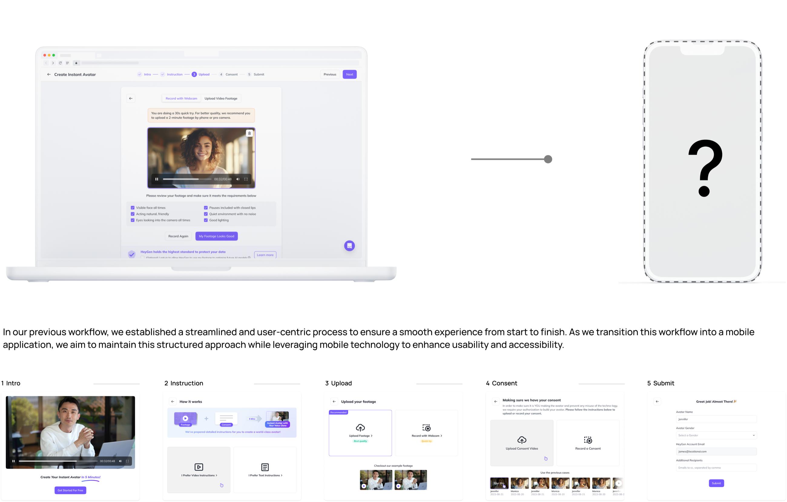
Research
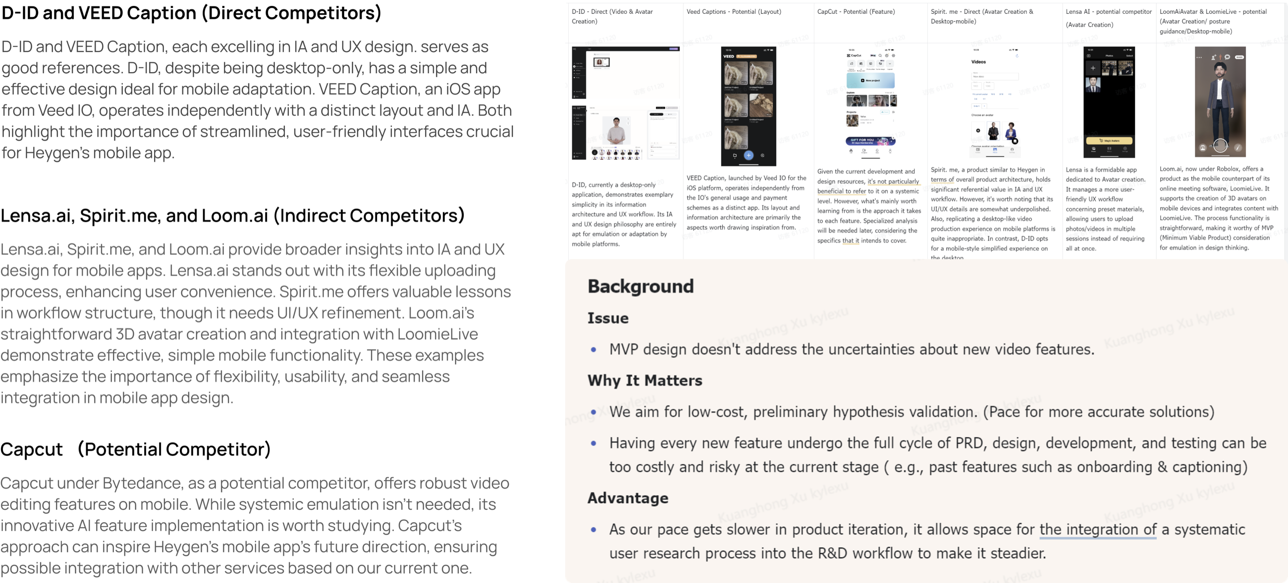
Customers might expect more from a phone than from the desktop, so I ran a series of competitive analyses to understand their needs and preferences for a mobile version, and the market of AI-powered video apps. D-ID and VEED Captions were the direct comparisons, each strong in information architecture and UX: D-ID desktop-only but simple enough to adapt to mobile, VEED Captions an iOS app with a layout of its own. Lensa.ai, Spirit.me and Loom.ai were indirect: Lensa's flexible uploading, Spirit.me's workflow structure, Loom.ai's straightforward 3D avatar creation. CapCut, under ByteDance, was the potential competitor, with robust editing on mobile and AI features worth studying.
The background for the MVP was written down at the same time. It didn't need to resolve the uncertainties around new video features; the aim was low-cost, preliminary validation of the hypothesis, because running every new feature through the full cycle of PRD, design, development and testing was too costly and too risky at that stage, as onboarding and captioning had shown. Its advantage: as the pace of product iteration slowed, there was room to bring a systematic user research process into the R&D workflow.
Goal
I began with an analysis of the customer base, which grounded the scope discussions with the CPO and the design and product teams. In those meetings we brainstormed solutions and named specific user needs, then organised and prioritised them with the Jobs to Be Done framework, so that the work lined up with what users were trying to accomplish. The main job: help users use Heygen's unique features on a phone, in their own scenarios, while driving Heygen's expansion and revenue. Under it, three jobs, demand for the unique features, usage shifting to mobile, and the expansion of business and services, each split into user-centric and business-centric sub-jobs.

Scope
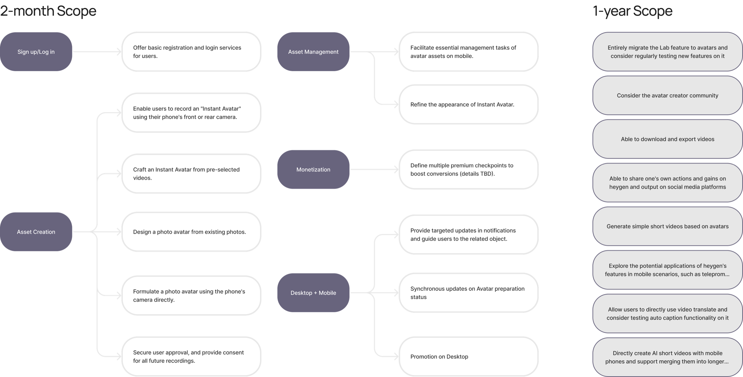
To handle what was coming, we organised the goals into two horizons, which clarified the priorities. The two-month scope: sign-up and log-in; asset creation, an instant avatar recorded with the phone's front or rear camera or made from pre-selected videos, a photo avatar from existing photos or from the camera, and consent for all future recordings; asset management on the phone; monetisation checkpoints; and desktop and mobile in sync, with notifications and promotion on the desktop. The one-year scope: migrate the Lab feature to avatars, an avatar creator community, download and export, sharing to social platforms, short videos from avatars, teleprompter-style uses, video translation, and short AI videos made on the phone. So the MVP had to be simple and intuitive, lean, and flexible in its information architecture and its interactions.
Prototyping
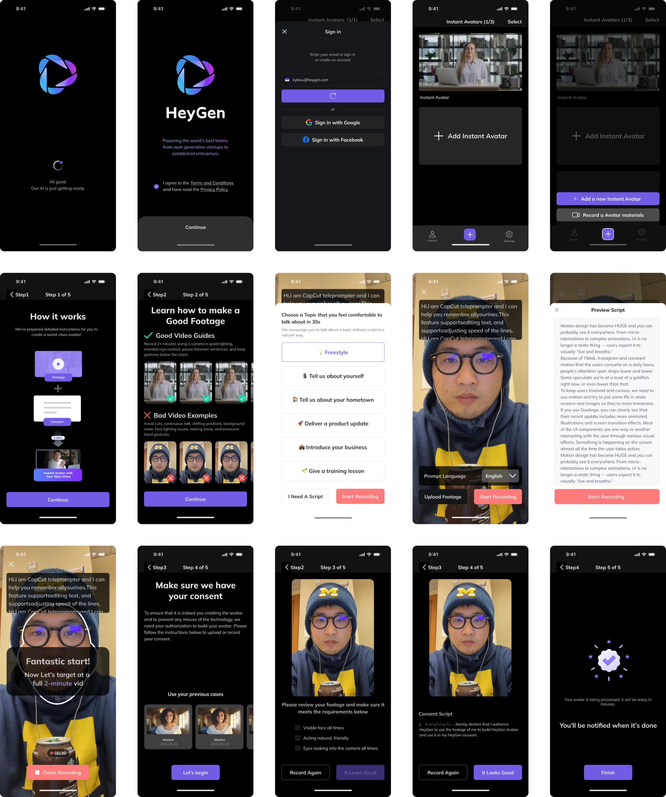
The MVP built on existing workflows, and moving them from the desktop to a phone was detailed work; every function had to be adapted to how people use a phone. Focusing on the three crucial functions, management, recording and consent, I made an 84-page mid-fidelity prototype in seven days: sign-in, the avatar list, the five recording steps with good and bad footage examples, a teleprompter with a choice of topics for a thirty-second freestyle, the footage review checklist, the consent script, and the processing screen.
Metrics
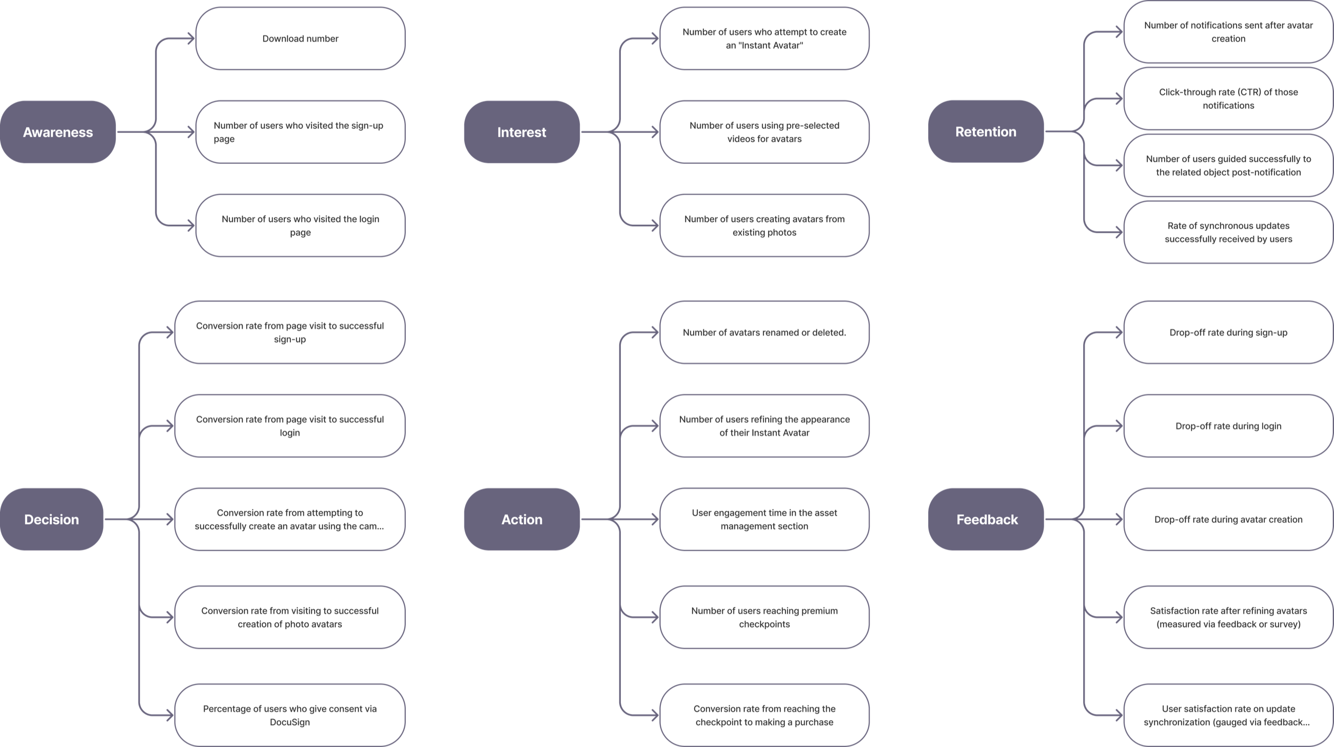
After the prototype I drew up an initial set of metrics for the PMs, on the funnel, to track engagement across the whole journey through the app: awareness (downloads, visits to sign-up and log-in), interest (attempts to create an instant avatar, use of pre-selected videos and existing photos), decision (conversion at each step, and the share who give consent through DocuSign), action (avatars renamed or refined, time spent in asset management, premium checkpoints reached and purchases made), retention (notifications sent and clicked through, users guided to the related object, sync updates received), and feedback (drop-off at sign-up, log-in and avatar creation, and satisfaction after refining an avatar and after a sync). They were meant to build a progressive picture to drive the iterations that followed.
Afterstory
The prototype was shared with a number of users for preliminary validation, and the feedback was positive. Set against Heygen's other, faster-growing services, though, the project showed less product-market fit and less potential growth impact, and it was postponed indefinitely. The decision taught me to separate a workable experience from a product worth scaling.
Part 7What the internship was
It was meant to be an internship. I worked as a junior designer with a mentor.
Lessons
Because the pace of my work was fast, the role became a hybrid of UX design and product management, and among the moving parts I learned to adapt to the many sides of the work. In a startup moving that quickly I worked in an agile way, with rapid prototyping and clear communication with the team, so that we could gather user feedback quickly and make the iterations it called for.
Through it I kept a user-centred approach, with the product's usability and relevance first. In a setting like that a designer has to deliver quickly while continuously adapting and learning, and the regular feedback and revision improved the product and, through it, my own work.
The best decision in this project is the one I reversed.
I'd argued from the layout, where one control fewer looked like a gain. Watching people use the editor was the better argument, and I should have started there.